
JavaScript is single-threaded, which means that by default there is a single thread, called the main thread that is responsible for doing all the work in the browser and deciding when to do it.
Most of the time we don’t notice the main thread. It’s just there, quietly doing work for us in the background. We usually only notice it when it gets overloaded and code doesn’t get executed in the time or in the order we expect. Honestly, being the main thread sounds like a bad job to me—I think too many of us can empathize with the feeling of doing literally everything, but only being noticed when we drop the ball.
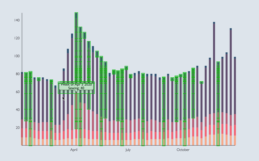
But anyway, I met the main thread one day when I was building a data visualization dashboard for a client. This client was building a tool for a large global health organization to visualize the ways they were affecting health outcomes around the world and wanted to be able to scroll through 10+ interactive visualizations on the same page.
One day, I got a bug report. According to the bug report, the page was locking up and failing to be interactive for several seconds after navigating to a new set of charts. On top of that, there was an animation in the navigation bar that would only happen after all the charts had loaded, which was confusing for the user.

I did some performance profiling, and this is when I noticed the main thread in the background saying “Hold on, I’m busy!” The main thread can’t calculate chart positioning, render thousands of SVG data points, process user interactions, and show a navigation animation at the same time. Something had to give, and it decided that interactivity and animation just wasn’t the top priority at the moment.
Unfortunately for my client, there weren’t any quick fixes to this problem that didn’t have major trade-offs. What I didn’t know at the time is that this bug report would launch a months-long exploration of why this was happening, and how to fix it. Over the past six weeks, I have been working on a fellowship here at Formidable to dive into data visualization performance with large datasets, and how we can improve Victory to take some pressure off the main thread.
Measuring Performance
Performance is a loaded term. It is subjective and can vary based on the device, the internet connection speed, the browser, or a user’s location. Profiling on our own machines can give us useful data, but it doesn’t tell the whole truth for our users. As a part of my research, I have been making comparisons by profiling development and production builds on my own machine, but keep in mind that the exact measurements would differ in other circumstances. What I can tell you is that if I am seeing performance issues on my work-issued MacBook Pro while using fiber internet and running the latest version of Chrome, other users are probably experiencing issues as well.
When we’re talking about performance or making comparisons, here are some metrics we can use.
Web vitals
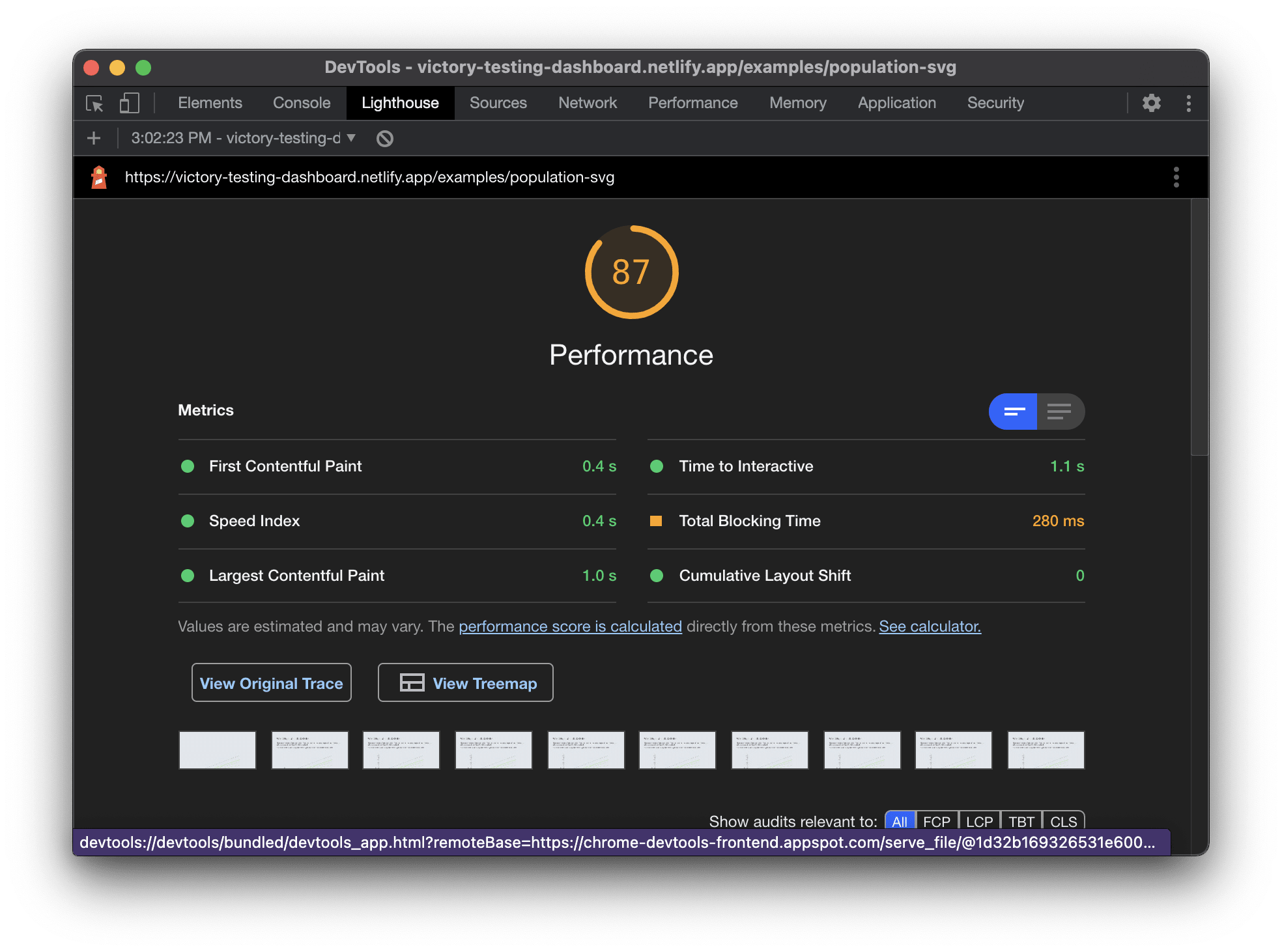
The metrics most commonly used to measure performance in 2021 are called web vitals. This is a set of measurements that can be taken at load time to measure how quickly the user sees content on the page (Largest Contentful Paint), how quickly the user can interact with the page (Time to Interactive), and how much layout shift occurs during load (Cumulative Layout Shift). We can use a tool like Lighthouse to measure these metrics in production.
Frames per second
In order for the UI to remain interactive and animations to appear smooth, we want the browser to be able to render at a rate of 60 frames per second. I like to think of the browser as one of those animation flipbooks: If we turn the pages quickly enough, the image looks like a smooth animation, but if we turn the pages slowly or skip pages, it appears to jump around.

Source: https://giphy.com/gifs/KWRG5ATZaiBOjCCjVO
When the browser is overloaded, this can result in dropped frames, which is like skipping pages in a flipbook. Instead of smooth animation, you might see a jerky motion from one state to the next.
Improving Performance
As I learned with that bug ticket, there is no quick fix for an overworked main thread in data-intensive applications. However, I was able to provide some recommendations at the time that still hold true after additional research.
Render less data
This one might sound obvious, but if we are rendering thousands of data points on the same page, it might be time to re-think this design. If there are visualizations that are rendering out of view, this might be a case for using an intersection observer to delay mounting this visualization until the user has brought it into view. Other options include aggregating, clustering, or downsampling the data to reduce the number of visible points, thus reducing the number of DOM nodes in the browser.
Offload other tasks from the main thread
When we are rendering performance-intensive data visualizations in the browser, the least we can do is free up the main thread to focus on rendering data. This might mean doing more work on the API side to format or manipulate the data, or using web workers to perform expensive calculations on a different thread.
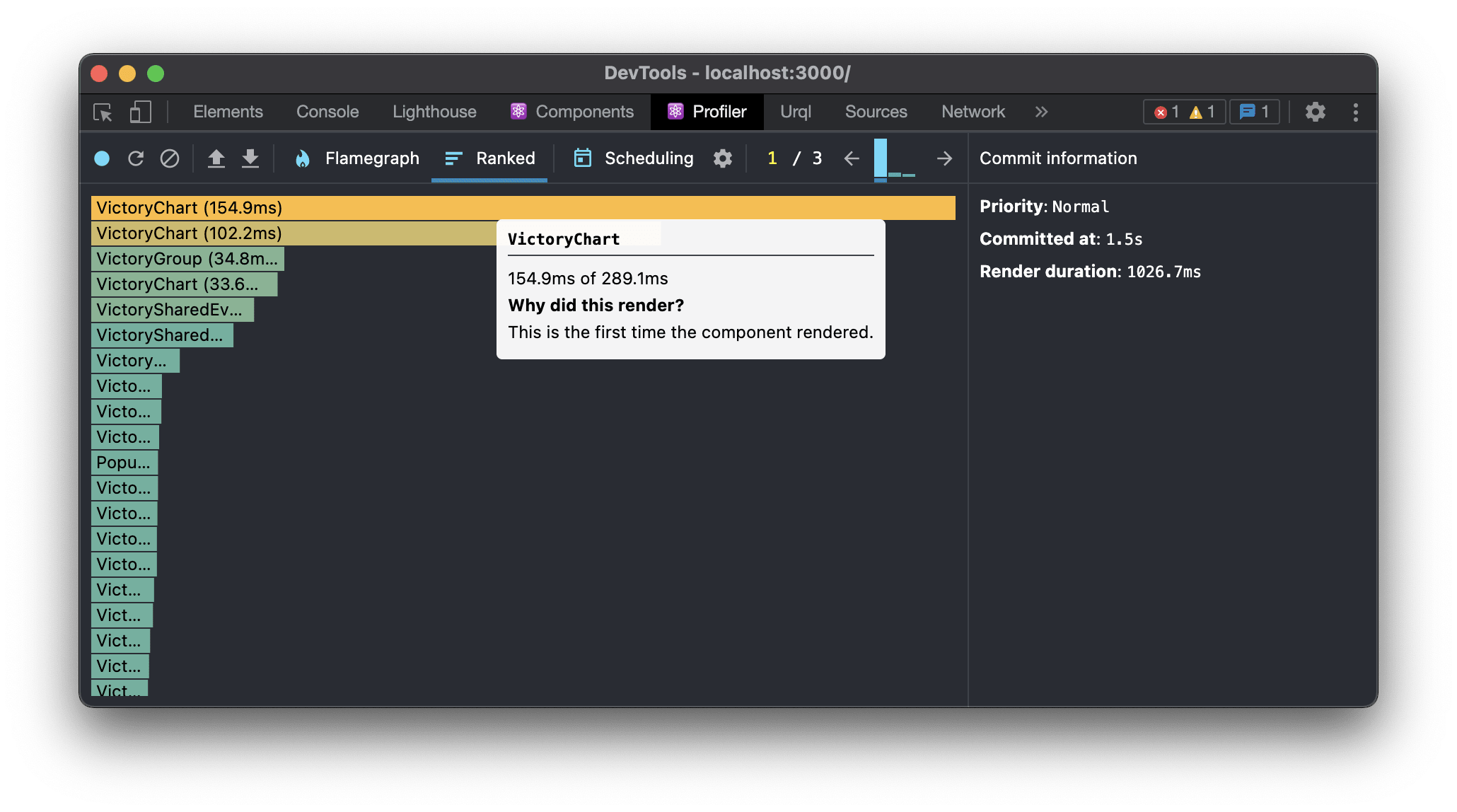
Reduce unnecessary re-renders and re-paints
If the UI is slow to interact or change state even for minor visual updates, this could be a sign that there are components re-rendering when they don’t need to. In React world, we can use the Profiler in the React dev tools to see which components are rendering, and why.
Chrome dev tools also provides a handy tool called Paint Flashing that enables you to see which parts of the UI are re-painting. If there are un-related parts of the visualization that are flashing on a state change, that might be an indication that caching or memoization could be used to cut down on render cycles if the data hasn’t changed.
This one looks good! Only the tooltips are re-rendering.
This one needs some help! The tooltips, axis labels, and bars are all re-rendering as the mouse moves around the chart.
Use a different rendering method
This is the strategy I spent the most time during my fellowship investigating.
SVG is currently the most popular way to build data visualizations in JavaScript, and for good reasons! It makes it easy to target and update individual elements, has first-class support in d3, and is used by libraries like Victory and Recharts. However, it is not the only way to render data visualizations in the browser. The Canvas API can improve the performance of large-scale data visualizations, as each canvas renders as a single DOM node rather than rendering a separate node for each SVG element.
There is also an experimental OffscreenCanvas API which allows us to render data to a canvas container inside a web worker. At the time of writing this, OffscreenCanvas only works in chromium-based browsers, but it may be more widely supported soon.
💡 I spent the bulk of my time experimenting with Canvas, since my primary focus was on 2D charts. If you want to learn more about 3D data visualization with WebGL, I would encourage you to check out Brian's post about building futuristic UIs in the browser.
To demonstrate these rendering methods, I built three nearly identical charts using SVG, Canvas, and OffscreenCanvas. Each of these charts has 286 lines and animated points.
SVG
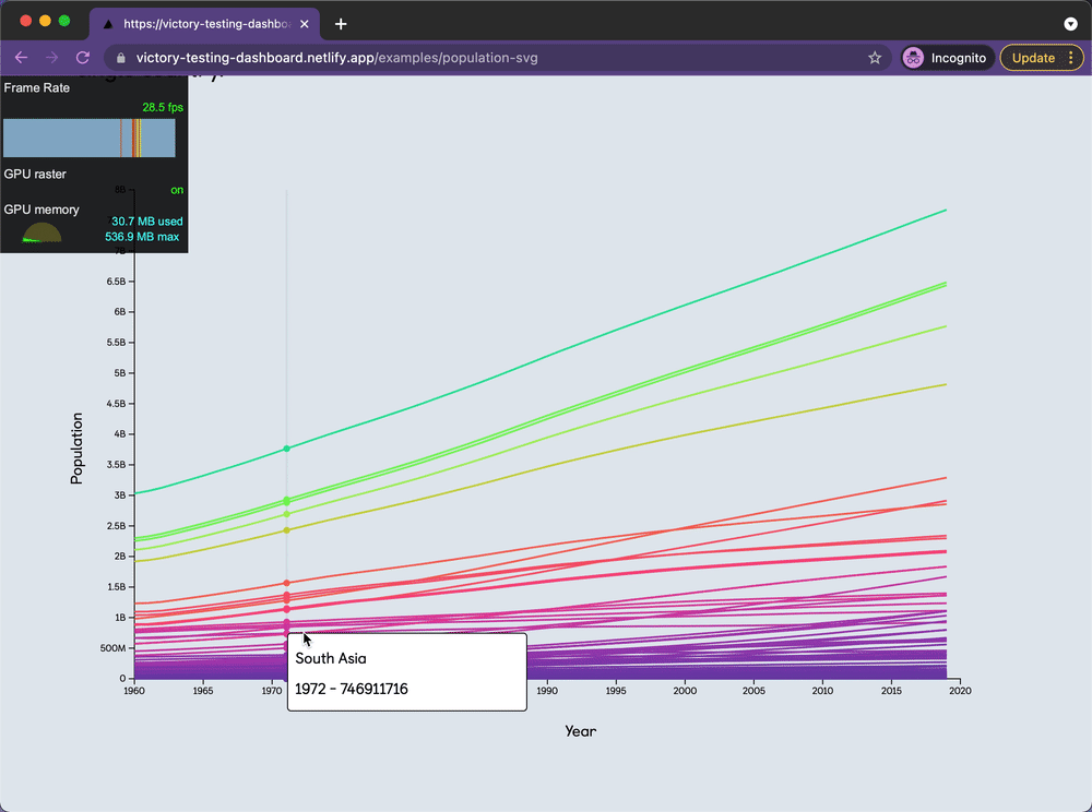
SVG looks the best at first glance. The chart is high-resolution at any screen size. However, Lighthouse pointed out that this chart was slower to load, and the animations were choppy due to a reduced frame rate and dropped frames.
Canvas
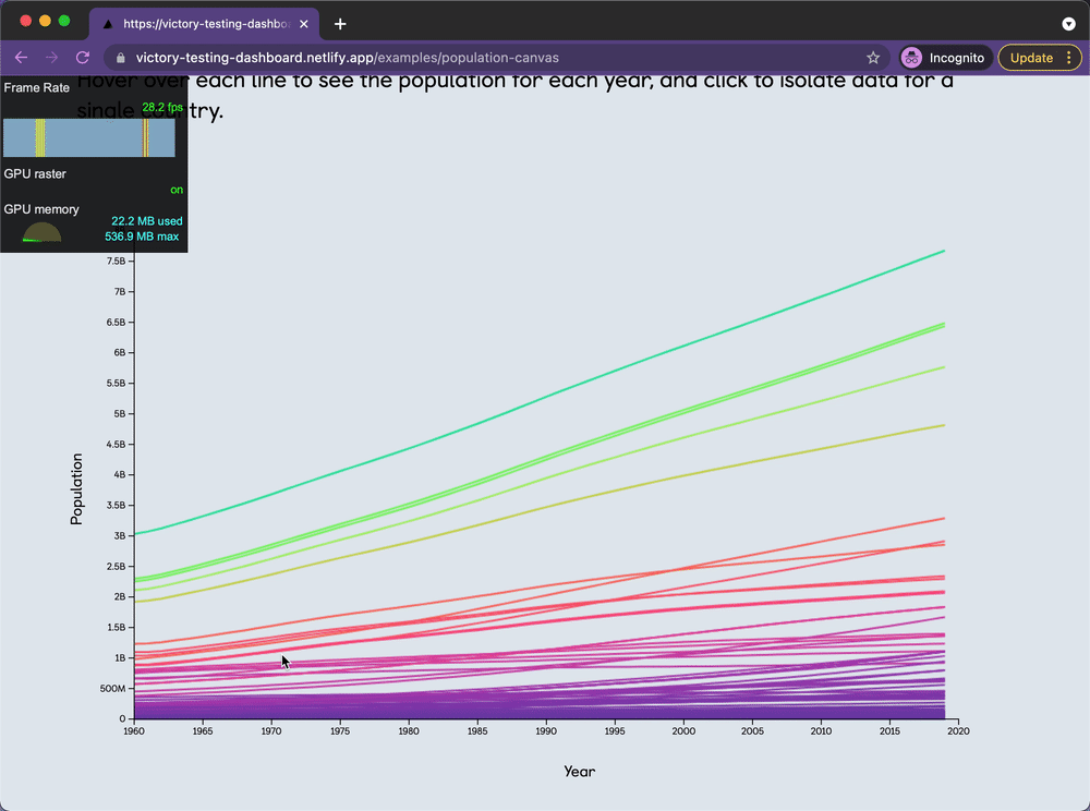
Using Canvas to render the lines and points allowed us to improve the web vitals a bit. Interestingly, the canvas example has smoother animations, but only a slightly improved frame rate, probably due to the sheer amount of data here.
Canvas + OffscreenCanvas
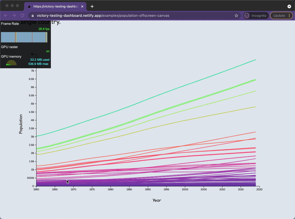
In this example, I moved the logic for rendering the lines and points on the canvas to a web worker via the OffscreenCanvas API. This experimental API really did result in a better frame rate, smoother animations, and fewer dropped frames than the other examples.
Takeaways
When it comes to building performant data visualizations, there may be no one-size-fits-all solutions, but the ecosystem is quickly evolving and giving us new possibilities. I am really excited by the potential of web workers and OffscreenCanvas, and I look forward to continuing to explore options like WebGL for building performant 3D visualizations.
This may not be good news for those of us who are already using developer-friendly SVG libraries like Victory but stay tuned for my next post where I will break down how to improve performance and explore alternative rendering methods with Victory. 📊
All of the examples used in this post can be found here.