Avoiding Pitfalls: What Every Front-End Developer Should Know About Headings

In front-end development, headings are a consistent source of mistakes. They seem simple at first glance. Just slap down some <h1>s, <h2>s, and whatever else you need whenever some text needs emphasis. But headings are deceptive in that they actually communicate a lot of information about your page to all of your users, including those using screen-readers, sighted users, and even the automated ones such as SEO bots. They also keep your page organized and help everyone understand the sections of a page and allow anyone to quickly scan to find information they need.
Because of that, headings need to be clear and organized, and err on the side of conciseness instead of verbosity.
They create a document outline
Headings create an outline of a page, just like in any other document. The designs we build often have bolded or enlarged text for emphasis, but we need to think carefully about what is actually a heading and what is not.
Semantics are separate from style
Text can be scaled up, have a different color, or have effects like text shadows, but that doesn’t mean that text is a heading. What you need to consider is: “Does this start a new section of the page?” Quite often, text is simply a single important sentence within a section instead of beginning a new section. Imagine if you only saw the outline before you could start scanning a page. Does the heading give context to what kind of content is within that section? Or is it noise? Is there anything substantial that would be contained in the section it creates?
Hierarchy in nesting headings
When nesting headings (for example, putting an <h3> under an <h2>) think about how the sections relate to each other. An <h3> should be directly related to the <h2> above it. Sometimes developers are tempted to use lower level headings like <h3> and <h4>, because the text has lower visual importance. Or sometimes because the heading is in a less emphasized section, i.e. “Related Blogs” at the bottom of a blog page. Only nest headings if they make sense in the case of an outline. The nested heading should absolutely relate to its parent heading. Be aware that it’s totally fine to use <h2>s all the way down a page!
When your front-end is built with a CMS or a design system, you need to take into account how your components can accommodate different heading levels. You might want to consider using a dynamic heading pattern if you’re using a tool like React.
Key Points
- Only use a heading if it makes sense in the context of a document outline.
- Only use a heading if it begins a new section on a page.
- Only nest headings if the sections are related to one another.
Headings in headers and footers
It’s very tempting to put an <h1> right in the header of your website around a title or logo. Nearly every website ever made has a logo that links to the homepage, however, you should avoid putting headings into headers in order to not pollute the page outline. A heading in a header will be added to every page and essentially add noise that screen-readers will read aloud every time the user accesses any page on your website. Additionally, sighted users probably won’t even recognize the text as a heading when they scan your page, so it provides no value to them either. The same goes for a footer that might have lists of links. Those lists may have text around them labeling what the list is for, but these labels aren’t really sections of the document. It’s very likely that any text like this in headers and footers should not be part of the document outline, and should just be <p> tags that are styled appropriately.
So in general, I would advise against putting headings in sections that will be on every page (such as header and footer). The exception is that there might be some specific content that you do want in the outline on every page. Just think carefully about it and understand the consequences of that decision. Sometimes, a developer will make headings in the footer a lower heading level, such as <h3> or <h4>, because they think footer headings are “less important” than the main section headings in the content of the page. What this actually will do is make the footer headings a subsection of whatever <h2> came before the footer, which can change every page. And that obviously doesn’t make any sense! So if you ever feel tempted to do that, it’s likely that the text is not even a heading at all.
Key Points
- Avoid using headings in headers for the site title or logo.
- Avoid using headings in footers for link lists or labels.
- Don’t use lower heading levels just because the heading seems less important.
Use one <h1> per page
While it’s technically allowed in HTML5 to use more than one <h1>, you should only designate one <h1> per page. Each page should have a clear singular title for the content within. This text does not have to be exactly the same as the <title> element. The difference is the <title> element provides the title for contexts external to your site (such as a search engine result or a browser tab), while the <h1> in the markup provides a title for contexts internal to your site.
HTML5 does allow more than one <h1> per page, but that pattern will create a totally flat structure, which is not as useful. So it’s never really a good idea to use more than one <h1> on a page.
If for some reason you have to implement a design that doesn’t have a clear <h1> visible, you should question why. Even if there isn’t a visible <h1>, you should at least make an invisible one in order to make a comprehensible outline. If the design you’re implementing does not include a heading that is clearly the page title, you can make it visually hidden so it’s only visible to SEO bots and screen-readers.
Key Points
- Never use multiple
<h1>s in a page. - Always include at least one
<h1>, even if it is visually hidden.
Don’t overuse headings
As developers, we often implement common designs such as a list of cards in a grid or a list of search results. If any text in one of these components is visually important, it’s tempting to make that text into a heading.
An issue with this is that every card essentially has its own section that might only have a small amount of content. It might not be very substantial at all, only containing a single sentence or maybe an image. When a screen-reader reads the outline aloud, each of those tiny sections will be added, making it harder for a user to audibly scan for what they need.
Instead, think about small components like cards as an item of a list that doesn’t need its own section, but rather have them be content as part of a broader section. Think about your use case: does it make sense for each card to be a section? If they are dense cards with lots of information, I think you could consider it. If it’s a tiny card with only an image and a link, I would say no; that case sounds like a plain, old list item.
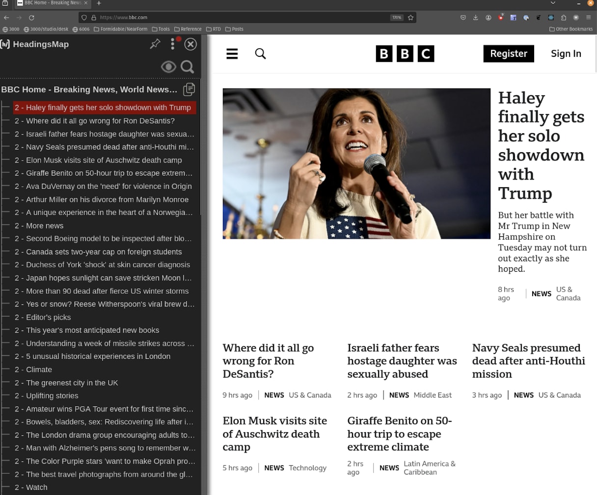
Look at this outline from bbc.com. Each small chunk of a news article gets its own heading – and they are even on the same level (2) as big sections like “Climate” and “Editor’s Picks”. Do you think this outline is scannable?
Optimizing your heading outline
One way to test this is to visualize your heading outline. You can use the browser extension HeadingsMap to do this, which is available for both Chrome and Firefox. When you view your outline, do all those cards seem excessive? When you view the sections they create, is there anything substantial there? Or is their content really part of their parent section?
Key Points
- Don’t add a heading for a small amount of content in cards or search results.
- Consider small components as content, not sections with a heading. Test your heading outline to ensure it is clear and concise.
Summary
The main lesson here is to think carefully about what elements you use in your code mean to different types of users. As developers, we often reach for tags that are more descriptive than <div> and <span> so that our HTML is more meaningful and semantic. But reaching for these elements can sometimes have harmful consequences if used incorrectly. The heading tags create an outline that spans the entire document, and you need to structure the HTML of a page to reflect that. For the last ten years, the front-end has moved to more atomic, component based systems where pages are made up of many parts that work together. This evolution is certainly helpful, but comes with risks when elements can affect the entire document rather than a single component. What is important for you, as a front-end developer, is to understand how those elements work and negotiate them into your components so that your page is clear and understandable to everyone who relies on them.