
Unlocking the Power of Storybook
Going beyond the Design System: how to use Storybook to develop, test, and validate all parts of a frontend application.
Storybook: more than a showcase
Storybook is a popular tool for frontend web development, best known as a showcase for Design Systems and UI Libraries. However, Storybook has features that are far more powerful than simply showcasing UI components!
Storybook is an excellent development environment and unit testing framework for most parts of a frontend web application.
- Here at Formidable, we use it for developing complex UI components, that perform data fetching and state management.
- We use it for testing hooks in a real browser.
- We use it for visually testing our CSS styles and breakpoints.
Follow along as I show you how we integrate it into our workflow!
What Formidable does
Formidable, a NearForm company, builds large, scalable applications for enterprise clients.
We recently implemented a Storybook integration for a large client's e-commerce website, and the results were fantastic. We achieved very high code coverage, increased developer velocity, and made the codebase easier to explore.
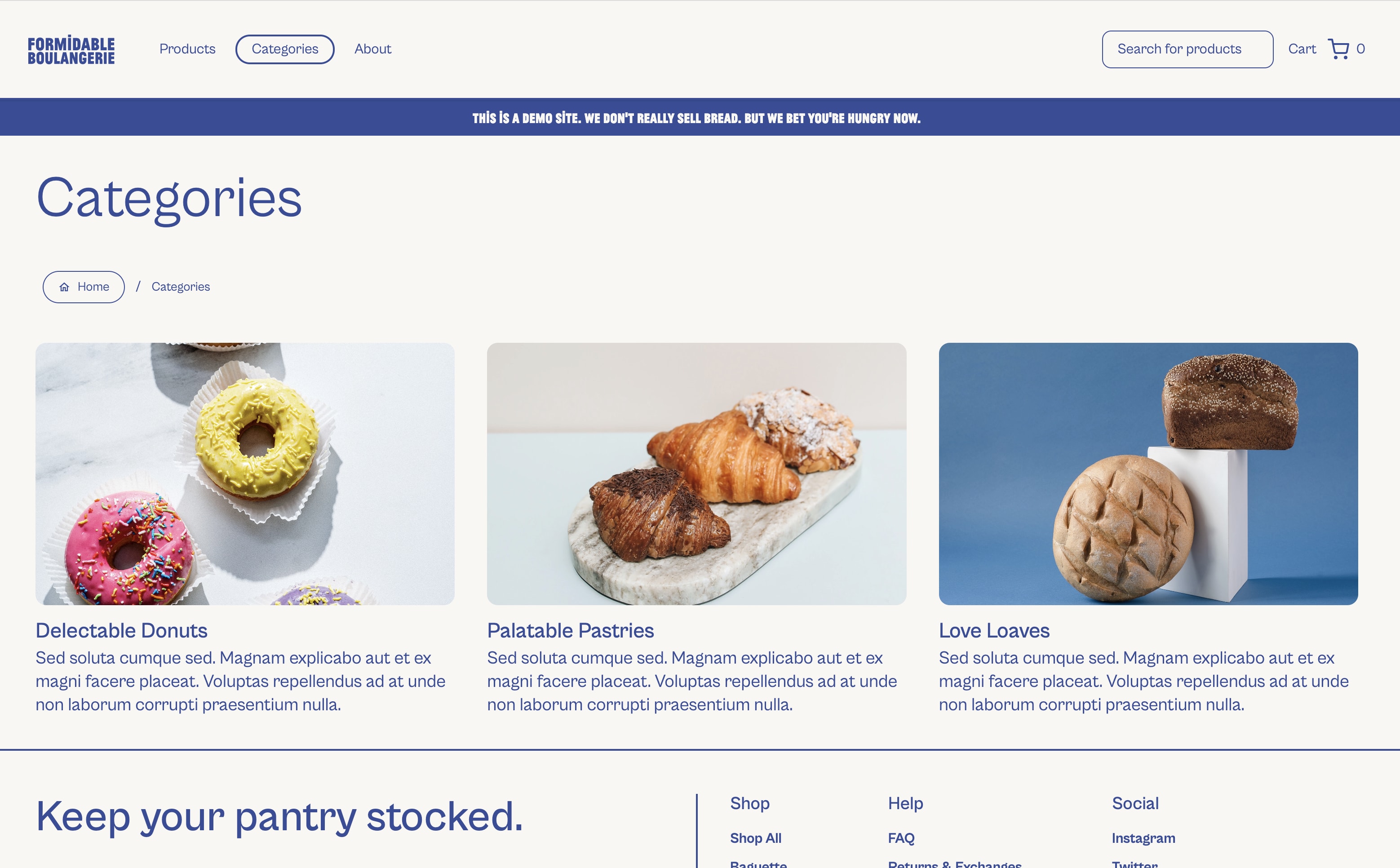
For the sake of this article, we will show code from a fictitious, open-source e-commerce website, "Formidable Boulangerie." This is a website built with React and NextJS, but this article applies to all frameworks compatible with Storybook (React, Vue, Angular, Web Components, etc).
Full examples of this code can be found at FormidableLabs/nextjs-sanity-fe
Using Storybook for Developement
Storybook is an excellent development environment for components.
- You use multiple stories to render components in all their various states.
- You interact with components in your browser, and manually test them.
- You can easily inspect elements and debug the code.
- You can do all of this in multiple browsers.
Installing Storybook is very easy, and their guide gets you running in a few minutes.
However, there's still one big hurdle to overcome. Storybook renders components "in isolation", but in a real application, components are rarely isolated! They usually have a lot of dependencies, like Contexts, CSS, framework configurations, and 3rd-party scripts.
The hardest part of integrating Storybook with an application is providing and managing these dependencies. Below are some of the strategies we used to handle them.
How to manage UI Dependencies
Applications are complex, and our components usually have a lot of dependencies. Even a simple Button will have at least CSS dependencies. To render most of our components, we need a way to provide those dependencies.
We used a global <TestHarness> component to supply the dependencies, and Storybook's "Decorators” and “Parameters" to customize the Test Harness on a per-story basis.
Create a Test Harness
Most React applications tend to have dozens of nested Providers at the root. Most components require many of these dependencies, so Storybook needs to provide them too.
In order to create stories for our components, we created a global <TestHarness> wrapper, which provides most of the dependencies that our root application provides. This includes:
- Top-level framework providers (eg.
react-router,framer-motion) - I18N Providers (eg.
react-i18next) - Common Styles (eg.
global.css,tailwind.css) - Global State (eg. a
<ShoppingCartProvider>) - 3rd-party script mocks (eg. Google Analytics)
For example, here we add a global MemoryRouter and a custom CartContext.Provider:
// .storybook/decorators/TestHarness.tsx
import { MemoryRouter } from "react-router";
import { CartContext, emptyCart } from "~/components/CartContext";
import "~/styles/global.css";

// 👇 Wrapper with all the App's required Providers, along with default values:
export const TestHarness = ({ children, route = "/", cart = {} }) => {
  return (
    <MemoryRouter initialEntries={[route]}>
      <CartContext.Provider value={{ ...emptyCart, ...cart }}>
        {children}
      </CartContext.Provider>
    </MemoryRouter>
  );
};
In a larger application, where the root could have dozens of providers, the <TestHarness> will likely need the same.
Full example: ~/.storybook/decorators/TestHarness.tsx
Use Decorators and Parameters
In Storybook, a Decorator is a wrapper around a story. We can add our TestHarness globally by adding it to our .storybook/preview.ts file like so:
// ~/.storybook/preview.ts
export const decorators = [
  (Story, ctx) => <TestHarness {...ctx.parameters}><Story /></TestHarness>
];
Full example: ~/.storybook/preview.ts#L16
Stories pass arguments to decorators via parameters. In the decorator above, we’re spreading all ctx.parameters as props to the TestHarness. So now, our stories can override the default route or cart by supplying these parameters:
// ~/components/Checkout.stories.tsx
export const WithLargeCart: Story = {
  parameters: {
    route: '/checkout',
    cart: {
      items: Array.from({ length: 10 }, () => ({ name: 'cart item' })),
      total: 100,
    },
  },
};
Mocking Third Party scripts
Decorators are also a great way to mock dependencies, like 3rd-party scripts. For example, a component that relies on Google Analytics could inject a window.dataLayer object like so:
// .storybook/preview.ts
export const decorators = [
  (Story, ctx) => {
    window.dataLayer = [];
    return <Story />;
  }
];
This decorator runs before each story loads, so it’s an easy way to ensure dependencies are set up correctly.
Using Storybook for Testing
Using Storybook as a development environment makes it really easy to manually test features. Wouldn't it be great if we could automate these manual tests?
Storybook Interaction Testing is the perfect way to do this! It lets you take your existing stories, automate the interactions, and make assertions!
Storybook added Interaction Testing in version 7.0, so it's still relatively new. However, it uses familiar tools (Jest's assertions, Testing Library selectors, Playwright runtime), so it's a solid environment with a shallow learning curve!
Benefits of Storybook Tests versus headless unit tests
When compared to Jest (or other headless unit testing tools), Storybook offers many major advantages:
- There’s no need to repeat the work of mocking a test environment, mounting components, or setting up different variants.
- You can visually see the UI that's being tested.
- You can use the browser's debugging tools, like the console,
debuggerstatements, element inspector, network inspector, React Developer Tools, etc. - Media queries work correctly, and you can test various CSS breakpoints.
- Browser APIs, like
IntersectionObserverormatchMedia, work correctly too. - You can easily test across multiple browsers.
- You can integrate visual regression testing with VERY little effort.
How it works: the play function
Every story can have an optional play function, and this is where the magic happens!
The play function has 2 purposes:
- It interacts with the story; getting the UI into a certain state. (eg. it fills out a form, or expands a menu)
- It makes assertions. (eg. it asserts a form validation error has the correct text, or expects menu items to be visible)
The play function runs immediately when the story is loaded, so you can actually see it running.
Here's a sample story for our Search component. It fills in a search term, and validates that search results are shown:
// ~/components/Search.stories.tsx
export const WithSearchTerm: Story = {
  async play({ canvasElement, step }) {
    const ui = wrap(canvasElement); // The `wrap` function is defined later in this article

    await step("type 'baguette' into the search box", async () => {
      ui.searchbox.focus();
      await userEvent.type(ui.searchbox, "baguette");
    });

    await step("expect to see a loading indicator", async () => {
      expect(ui.resultsBox).toBeVisible();
      expect(ui.resultsBox).toHaveTextContent("Loading...");
      expect(ui.resultItems).toHaveLength(1);
    });

    await step("expect to see some search results", async () => {
      // Search results are loaded after a short network delay, so we need to wait:
      await waitFor(() => {
        expect(ui.resultItems.length).toBeGreaterThanOrEqual(2);
      });
    });
  },
};
Full example: ~/components/Search.stories.tsx#L26
When you load the story, the test runs quickly, and the results are shown immediately:
The Debugging Experience
Since the Stories and the tests all run inside your browser, the debugging experience is excellent. You simply use all the browser's debugging tools that you're already familiar with. You can set breakpoints, inspect the DOM, manipulate CSS, and even use developer extensions, like React Developer Tools.
Visual Regression Testing
Most of our automated tests validate business logic; is an element visible, does it contain the correct text, does it react correctly to user interactions, etc. While these tests focus on our JavaScript and HTML logic, they ignore a large part of our codebase: the CSS.
CSS is a huge, fragile part of our application, and it deserves thorough testing.
Yet CSS is really hard to test! CSS is just the implementation detail for implementing a visual appearance and layout. Ideally, we want to ignore the implementation, and just validate the appearance, but we can't validate appearance by writing assertions.
The best way to validate CSS is via Visual Regression testing -- aka "screenshots". If a picture says a thousand words, then a screenshot makes a thousand assertions. A single screenshot validates so many things simultaneously:
- Layout, alignment, responsiveness
- Text content, size, color, weight, transformation
- Image loading, scale
Storybook is the perfect environment for capturing these screenshots. The components are isolated, consistent, and represent many variations. And best of all, with a little configuration and almost NO code, you can add screenshot tests to EVERY SINGLE story in your application. Imagine, every Story you create comes with dozens of assertions AUTOMATICALLY. It's a wonderful feeling!
Chromatic provides the perfect workflow
Chromatic is Storybook's paid product, and is by far the best way to achieve Visual Regression Testing. This is not an ad; we're just a big fan of this product. We use it on many of our OSS projects at Formidable, and it provides a lot of great features. It has a generous free tier, and is straightforward to integrate into CI.
Its biggest, unique value is how it enables a very smooth workflow for Visual Regression Tests. Here's our typical workflow:
- A developer creates a Pull Request, which contains UI changes.
- Chromatic automatically captures a screenshot of each Story, and compares it against a baseline.
- If there are differences, the PR gets blocked, awaiting Visual Review for any UI changes.
- Chromatic provides the Visual Review interface, where you compare the differences and approve or deny each one. You can comment on changes, and the interface is easy to use.
- Chromatic even hosts your Storybook, so you can open the stories yourself without running anything locally.
- If all changes are approved, the PR gets unblocked.
- Once the PR is merged, the "baselines" are updated, and the process continues.
This workflow solves a lot of the common problems with Visual Regression Tests. First off, cloud machines capture all the screenshots, so they're consistent and not dependent on different hardware. The screenshots are not committed to the repo, so it's easy to approve and update baselines, and avoid merge conflicts. And since this happens in CI, developers don't need to update screenshots locally.
Here’s a quick example of the workflow in action. This is a PR with a subtle CSS change to the color of a line. Chromatic quickly reports “1 change must be accepted”. Reviewing the change is easy, with side-by-side diffs and various ways to highlight the changes. I can Approve, Deny, or Comment on each diff. Once approved, the PR is unblocked!
Chromatic makes it easy to see the UI changes, lets you play with them in your browser, and does a great job at ensuring your CSS is fully tested before merging.
Strategies for writing better tests
One area of Storybook is still rough and could use some improvement: test organization.
Most unit test frameworks use nested describe, before, beforeEach, and it blocks to organize, group, and share logic across tests. Unfortunately, Stories can only have a single play function. So here are a couple of strategies we use to keep things organized.
Use step to break things down
The play function can get rather large; break it down using step! This adds structure to your tests, is self-documenting, improves test logging, and the UI even lets you execute steps 1-by-1 for debugging. Use step generously!
// ~/components/Search.stories.tsx
export const WithSearchTerm: Story = {
  async play({ canvasElement, step }) {
    await step("type 'baguette' into the search box", async () => {
      // ...
    });
    await step("expect to see a loading indicator", async () => {
      // ...
    });
    await step("expect to see some search results", async () => {
      // ...
    });
  },
};
Reusable selectors
Every play function interacts with elements on the page. We found it best to encapsulate the "selector logic," making it reusable across stories, and making the tests easier to understand.
All of our stories use a wrap function like below, making it easy to interact with the UI:
// ~/components/Search.stories.tsx
function wrap(canvasElement) {
  // Use `within` (from @storybook/testing-library) to target UI elements:
  const container = within(canvasElement);
  return {
    // 👇 We name all our components, especially when the selectors are generic:
    get searchbox() { return container.getByRole("searchbox"); },
    get resultsBox() { return container.getByRole("listbox"); },
    get resultItems() { return container.queryAllByRole("listitem"); },
  };
}

export const WithSearchTerm: Story = {
  async play({ canvasElement, step }) {
    const ui = wrap(canvasElement);

    await step("type 'baguette' into the search box", async () => {
      // 👇 Tests are easy to read, write:
      ui.searchbox.focus();
      await userEvent.type(ui.searchbox, "baguette");
    });

    // ...
  }
};
Full example: ~/components/Search.stories.tsx#L113
Create "test-only" stories
Not every test makes a good story. We often write tests that end with the UI in a messy or redundant state. Since Storybook is still a showcase of our components, we don't want to showcase these stories.
Since there's no way to hide these Stories, we give them names that indicate they're "test-only":
export const WithSearchTerm: Story = {
  // ...
};
export const WithSearchTerm_Test_Cleared: Story = {
  // This story clears the search, so it's a redundant Story, but a good test.
  name: "With Search Term / Test / Cleared",
  // ...
}
Full example: ~/components/Search.stories.tsx#L91
Reuse the play functions
Since there are no before / beforeEach hooks, we need a different way to reuse setup logic.
Fortunately, it's easy for a Story to call the play function of another story!
For example, we have a story, WithSearchTerm, that enters a search term, and waits for the results to be populated. Using this as a starting point, we then want another test WithSearchTerm_Test_Cleared that clears the search term. We can do this by simply calling WithSearchTerm.play from the new story:
export const WithSearchTerm: Story = {
  async play({ canvasElement, step }) {
    // (types a search term, and waits for the results to display)
  }
}

export const WithSearchTerm_Test_Cleared: Story = {
  async play({ canvasElement, step }) {
    const ui = wrap(canvasElement);

    // 👇 Reuse the previous Story's steps:
    await WithSearchTerm.play({ canvasElement, step });

    await step('clear the search box', async () => {
      await userEvent.clear(ui.searchbox);
    });
  }
}
Full example: ~/components/Search.stories.tsx#L95
The End Result
After a few months using Storybook for testing, our team added tests for over 350 components and hooks, with test coverage for 6000 lines of code (over 60% of the application). We have a higher velocity now, due to this fantastic development environment. We enjoy writing stories, because they eliminate repetitive manual testing. We’ve tested parts of the application that were difficult to test otherwise. And PRs are easier to review, because screenshots are added automatically.
The hardest part of this integration was getting components with dependencies to render in isolation, a challenge with any unit test framework. But the strategies above helped overcome this challenge, and we’re now enjoying the benefits of component-driven development and testing.