
Theming is a challenge that most front-end developers will have to face at some point. There is a lot to consider when picking an approach to theming today: CSS variables, CSS-in-JS, and frameworks like Tailwind.
In this blog post, we're going to look at theming a React application with Vanilla Extract, which solves a lot of our theming problems in a single CSS-in-JS library.
What is Vanilla Extract?
Started by Mark Dalgleish, co-creator of CSS Modules, Vanilla Extract is one of the latest CSS-in-JS libraries to gain traction. It enables "maintainable CSS at scale without sacrificing platform features" by being type-safe, having zero runtime costs, and utilizing CSS variables. Let's take a look at what that means for theming!
100% TypeScript
Type safety is very much at the core of Vanilla Extract. A benefit to using TypeScript for writing styles is that your code editor will be able to make code completion suggestions based on the shape of your theme object. You will also never end up with declarations like font-size: undefined; in your stylesheets as your compiler will alert you to any missing or misspelled properties.
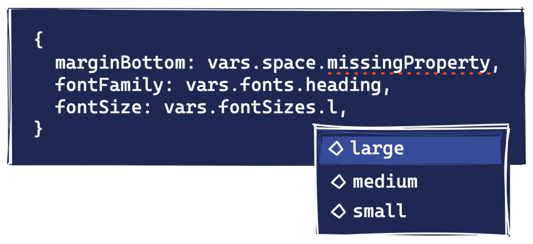
Vanilla Extract enforces type-safety by requiring you to write styles in .css.ts files; this could be a single file per component or shared across multiple components. The downside to this is that you cannot co-locate your styles in the same file as the associated component, however, it does create a separation of concerns and will feel familiar if you have ever used CSS Modules or written regular CSS in external stylesheets.
Another benefit to using this specific file type is that, regardless of whether the rest of your codebase uses TypeScript or not, you can still benefit from type safety within your styles.
Zero-runtime
The .css.ts extension is also helpful as it lets Vanilla Extract know exactly where your styles are located: This enables the library to generate stylesheets at build time and ensures that style definitions do not end up in your JavaScript bundle.
Being zero-runtime makes Vanilla Extract different from other CSS-in-JS libraries like Styled Components and Emotion; both of these libraries provide exceptional developer experiences but have notable problems with performance due to evaluating which styles need to be in the document at runtime rather than at build time.
CSS Variables
If you have used other CSS-in-JS libraries for theming you will be familiar with the concept of a theme provider. Theme providers use React's Context API to provide access to theme tokens throughout your React application without needing to pass props to each—this works well but can cause unnecessary re-renders.

Instead, Vanilla Extract uses native CSS variables, which have other benefits such as being able to scope variables within a style block. A practical use case for this could be changing color values for light/dark mode or changing spacing values and font sizes at different breakpoints.
Creating Themes
Now that we understand what's behind Vanilla Extract we can take a look at ways in which you can use it to theme your application. Once you’ve got the library set up, the first step is defining your theme. The function(s) you use to create your theme will depend on whether you have a single theme or multiple themes, e.g. light and dark.
Single theme
For applications with a single, global theme, Vanilla Extract gives us the createGlobalTheme function which allows us to set variables to a selector like the :root pseudo-class or a custom class/ID. This returns a "theme contract", a term the library uses to reference the shape of the theme that you have created.
import { createGlobalTheme } from "@vanilla-extract/css";

export const vars = createGlobalTheme("#app", {
  space: {
    small: "4px",
    medium: "8px",
    large: "16px",
  },
  fonts: {
    heading: "Georgia, Times, Times New Roman, serif",
    body: "system-ui",
  },
  colors: {
    primary: "#1E40AF",
    secondary: "#DB2777",
    text: {
      normal: "#1F2937",
      dimmed: "#6B7280",
    },
  },
});
Multiple themes
If your application has multiple themes, for example, light and dark mode, the first thing you will want to do is create a skeleton of your theme object with createThemeContract. The values can be set to null as this is just to ensure that themes created with this contract have the correct keys. The theme contract gets passed to createTheme as the first argument.
import { createTheme, createThemeContract } from "@vanilla-extract/css";

const colors = createThemeContract({
  primary: null,
  secondary: null,
  background: null,
  text: {
    normal: null,
    dimmed: null
  }
});

export const lightTheme = createTheme(colors, {
  primary: "#1E40AF",
  secondary: "#DB2777",
  background: "#EFF6FF",
  text: {
    normal: "#1F2937",
    dimmed: "#6B7280"
  }
});

export const darkTheme = createTheme(colors, {
  primary: "#60A5FA",
  secondary: "#F472B6",
  background: "#1F2937",
  text: {
    normal: "#F9FAFB",
    dimmed: "#D1D5DB"
  }
});
Combining the two
In the light and dark theme example above, I have only declared colors—this is because, if you were to add tokens for other theme properties such as spacing, font size, and line height, you would have to redeclare all of those properties and values for both themes. We could spread the shared properties to both theme objects, but that would result in duplicated variables in our CSS output.
Instead, we can create a global theme for everything else and combine the contracts as a single export:
import { createGlobalTheme, createTheme, createThemeContract } from "@vanilla-extract/css";

const root = createGlobalTheme("#app", {
  space: {
    small: "4px",
    medium: "8px",
    large: "16px"
  },
  fonts: {
    heading: "Georgia, Times, Times New Roman, serif",
    body: "system-ui"
  },
});

const colors = createThemeContract({
  primary: null,
  secondary: null,
  background: null,
  text: {
    normal: null,
    dimmed: null
  }
});

export const lightTheme = createTheme(colors, {
  primary: "#1E40AF",
  secondary: "#DB2777",
  background: "#EFF6FF",
  text: {
    normal: "#1F2937",
    dimmed: "#6B7280"
  }
});

export const darkTheme = createTheme(colors, {
  primary: "#60A5FA",
  secondary: "#F472B6",
  background: "#1F2937",
  text: {
    normal: "#F9FAFB",
    dimmed: "#D1D5DB"
  }
});

export const vars = { ...root, colors };
Note: if you are using this method to combine theme variables, ensure that the global theme is scoped to the same element as the color themes, otherwise you may try to access variables that do not exist within the scope.
Applying Themes
For global themes, Vanilla Extract will apply tokens to the selector we specified in the form of CSS variables:
#app {
  --space-small__1n3aqay0: 4px;
  --space-medium__1n3aqay1: 8px;
  --space-large__1n3aqay2: 16px;
  --fonts-heading__1n3aqay3: Georgia, Times, Times New Roman, serif;
  --fonts-body__1n3aqay4: system-ui;
}
In the light/dark mode example above, we stored the returned values from createTheme to lightTheme and darkTheme constants. Each value is a class name that can be applied to an HTML element to declare the CSS variables. For example, you could conditionally add each class name based on state:
import { useState } from "react";
import { darkTheme, lightTheme } from "styles/theme.css";

const App = ({ children }) => {
  const [isDarkTheme, setIsDarkTheme] = useState(false);

  return (
    <div id="app" className={isDarkTheme ? darkTheme : lightTheme}>
      {children}
      <button onClick={() => setIsDarkTheme((currentValue) => !currentValue)}>
        Switch to {isDarkTheme ? "light" : "dark"} theme
      </button>
    </div>
  );
};

export default App;
The stylesheet will now contain the CSS variables for these two themes:
.theme_lightTheme__1n3aqayg {
  --primary__1n3aqayb: #1E40AF;
  --secondary__1n3aqayc: #DB2777;
  --background__1n3aqayd: #EFF6FF;
  --text-normal__1n3aqaye: #1F2937;
  --text-dimmed__1n3aqayf: #6B7280;
}
.theme_darkTheme__1n3aqayh {
  --primary__1n3aqayb: #60A5FA;
  --secondary__1n3aqayc: #F472B6;
  --background__1n3aqayd: #1F2937;
  --text-normal__1n3aqaye: #F9FAFB;
  --text-dimmed__1n3aqayf: #D1D5DB;
}
Accessing Theme Tokens
The key to using tokens within our code is the vars theme contract we created and exported earlier. By importing it from our theme file we can reference any of our properties and Vanilla Extract will do the hard work of matching it to the CSS variable.
Global styles
We can use theme tokens to create global styles:
import { globalStyle } from "@vanilla-extract/css";
import { vars } from "styles/theme.css";

globalStyle("#app", {
  padding: vars.space.large,
  fontFamily: vars.fonts.body,
  background: vars.colors.background,
  color: vars.colors.text.normal,
  minHeight: "100vh"
});
Resulting in:
#app {
  padding: var(--space-large__1n3aqay2);
  font-family: var(--fonts-body__1n3aqay4);
  background: var(--background__1n3aqayd);
  color: var(--text-normal__1n3aqaye);
  min-height: 100vh;
}
Component styles
We can use theme tokens to create component styles:
import { style } from "@vanilla-extract/css";
import { vars } from "styles/theme.css";

export const root = style({
  fontFamily: vars.fonts.heading,
  marginBottom: vars.space.small,
  color: vars.colors.primary
});
The styles created above can then be set on an element with the className attribute:
import React from "react";
import * as styles from "./Heading.css";

const Heading = ({ children }) => <h1 className={styles.root}>{children}</h1>;

export default Heading;
Resulting in:
.Heading_root__2ec7vh0 {
  font-family: var(--fonts-heading__1n3aqay3);
  margin-bottom: var(--space-small__1n3aqay0);
  color: var(--primary__1n3aqayb);
}
Creating Utility Classes From Tokens
CSS frameworks like Tailwind provide us with constraint-based utility classes that we can use throughout our application for visual consistency. Vanilla Extract gives us the power to create utility classes suited to our requirements with its Sprinkles API, which is not dissimilar to the likes of Styled System and Theme UI.
Below we're going to take a look at how you can create a responsive typography utility that applies both font-size and line-height values with a single custom property.
Defining properties
Firstly, we're going to add a few properties to our global theme:
const root = createGlobalTheme("#app", {
  ...otherProperties,
  fontSizes: {
    small: "16px",
    medium: "20px",
    large: "36px",
  },
  lineHeights: {
    small: "24px",
    medium: "28px",
    large: "40px",
  },
});
Now we want to use the defineProperties function to define the different conditions that our properties may change in—in this case, we are going to add the ability to change text size at different breakpoints. This is also where we define the shorthand to apply both our font size and line height at once.
import { createSprinkles, defineProperties } from "@vanilla-extract/sprinkles";
import { vars } from "styles/theme.css";

const responsiveProperties = defineProperties({
  conditions: {
    mobile: {},
    tablet: { "@media": "screen and (min-width: 768px)" },
    desktop: { "@media": "screen and (min-width: 1024px)" }
  },
  defaultCondition: "mobile",
  properties: {
    fontSize: vars.fontSizes,
    lineHeight: vars.lineHeights
  },
  shorthands: {
    text: ["fontSize", "lineHeight"]
  }
});

export const sprinkles = createSprinkles(responsiveProperties);
Once we've defined our properties and exported them with createSprinkles, we can use the new utility within our styles. Note how we can change the type variant for different screen sizes without declaring a media query.
import { sprinkles } from "styles/sprinkles.css";

export const message = sprinkles({
  text: {
    mobile: "small",
    tablet: "medium",
    desktop: "large"
  }
});
We can also use sprinkles directly in our components:
import React from 'react';
import { sprinkles } from 'path/sprinkles.css';

export const Message = ({ children }) => (
  <p
    className={sprinkles({
      text: {
        mobile: "small",
        tablet: "medium",
        desktop: "large",
      },
    })}
  >
    {children}
  </p>
);
Summary
In this post, we looked at how quickly and easily you can get started theming a React application with Vanilla Extract. We learned how to create themes, apply variables to our page, and access tokens from our styles and components. See the CodeSandbox below for an application created using the examples in this post.
https://codesandbox.io/s/vanilla-extract-theming-ci1jq?file=/styles/theme.css.ts
We've only scratched the surface of what you can do with Vanilla Extract. If you're interested in learning more, head over to the documentation and check out the additional resources below.