
I've been working in web design for the past decade and some would say that we have never had it so easy. The plethora of techniques we now have to layout content on the web would make most people's minds boggle. But has all this new stuff actually made our life easier or has every solution just unearthed a new set of problems?
In this article, we will be looking at how layout on the web went from fixed to fluid, and fluid to responsive, asking ourselves: What's next? We will examine if APIs like ResizeObserver can be used in combination with front-end frameworks to help us emulate the legendary element query. Finally, we will create some self-aware UI.
I find the context fascinating, but feel free to skip the history lesson and jump straight to the ResizeObserver section.
A brief history of responsive web design
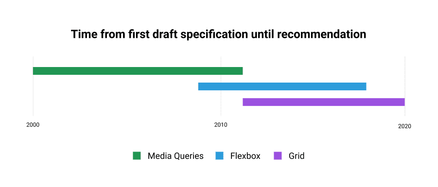
The first iPhone was released more than 13 years ago, starting a mobile device revolution that drastically altered how people interact with websites. Designers and web developers were forced to rethink content layout and user-interaction for devices with a screen about a third of the standard 960px grid and with no physical mouse or keyboard. When the mobile revolution started, most sites rendered at a single fixed width. Media queries were in their infancy, and flexbox and CSS grid were still nearly a decade away. We were totally unprepared.
While designers and developers struggled to invent the techniques, tools, and even the vocabulary they would need to accommodate the mobile revolution, users were served fixed-width websites on screens much smaller than what they were designed for.
Nobody misses "pinch-to-zoom" on the web.
m.website.com
One of the earliest techniques for dealing with the situation involved serving a dedicated mobile website. Whenever user-agent sniffing detected the client was a handheld device, users would be redirected to a subdomain like m.website.com. This kind of hard binary switching allowed companies to deliver better mobile user experiences without needing to write full mobile applications. Mobile sites could be written using the same languages (HTML/CSS/JS) and served up by the same stack. Unfortunately, this solution did require maintaining multiple codebases — one for desktop and one for mobile...
...And one for tablets. Though quite a few companies (most notably facebook.com) still serve multiple versions of their site for different devices, the introduction of tablet-sized devices made this approach much less appealing. Rather than trying to create dedicated tablet-optimized sites, many simply added "view the desktop version of this site" prompts for mobile and tablet users.
Querying the media
Eventually, some forward-thinking web developers had an idea. Instead of switching subdomains based on user agent, why don't we switch layout based on the viewport width? Basic media type detection has been around since CSS2. The ability to query not just the media type but the dimensions – width, height, and orientation – of the viewport from within CSS was added and was supported by most browsers by 2012. This addition opened up the doors to all kinds of possibilities and layout permutations. This was lucky because soon enough there weren't just 3 screen sizes to worry about, there were quite literally hundreds.
So now that we had media queries, what excuse did we have for our websites not looking great on every device? Once the desktop/mobile binary broke down, developers and designers had so much to consider. Rather than creating multiple fixed-width sites, designers and developers were expected to create mobile-friendly interfaces that would morph and adapt to fill available space on the desktop. This kind of polymorphic layout was a hard problem to solve. Like really hard. Even with media queries it was non trivial.
Media queries had a few limitations that made life more difficult:
- They are global, which made them difficult to reconcile with the notion of "components" slowly being popularised by libraries like Angular and React. Elements were still blissfully unaware of their surroundings — their parent or siblings.
- They are verbose. Essentially media queries translate to a load of if statements. Mapping styles to markup at all the common breakpoints (360, 540, 720, 900, 1080) became unwieldy, hard to make guarantees about, and thus time-consuming to test.
Content is like water
So we prayed to the CSS gods once more. This time, they delivered us the flexbox specification — an API that seemed to promise everything.
The Flexbox Layout (Flexible Box) module (a W3C Candidate Recommendation as of October 2017) aims at providing a more efficient way to lay out, align, and distribute space among items in a container, even when their size is unknown and/or dynamic.
https://css-tricks.com/snippets/css/a-guide-to-flexbox/#flexbox-background
It was a much more "flexible" way of describing layouts. Instead of prescribing exactly how some UIs should be laid out on a page, we were able to set tolerable bounds. It was now possible to make children of a flex container grow or shrink to take up available space and to share space rationally amongst themselves based on values like intrinsic widths.
It felt crazy powerful, like elements on the page had become self-aware. Furthermore, these rules were not global; they were scoped to an element by selectors just like other CSS properties.
Container queries?
The combination of media queries and flexbox, as powerful as it may be, was still not enough for some people. As frameworks like React gained popularity, the component model started to dominate how people thought about web design and development. Shouldn't developers be able to control the stylistic properties of an element based on its own size? Not the media type, not on the size of the viewport, but on the size that the element itself was being rendered within its parent? This idea of "element queries" or "container queries" spread like wildfire, and soon became one of the most requested CSS features of all time. Unfortunately, container queries are a bit trickier to implement than you might first think.
Imagine a scenario whereby container queries exist. You have a child element (an image) within a parent element (a div). Let's say you want the image element to display: block whenever the parent div is narrower than 320px, and to display: none otherwise. Now, imagine the parent reaches 319px. That's fewer than 320px, so the image renders, but uh oh... the image turns out to be 480px wide! The parent element expands to fit its child, making its width larger than 320px and causing it to hide the image, but now the parent has no contents so it reverts back to 319px showing the image again. Repeat ad infinitum.
This somewhat contrived example illustrates the main issue with supporting container queries natively in CSS — it makes creating infinite loops and cyclic dependencies all too easy. This kind of endless recursion would block up the UI thread entirely and would eventually crash the browser. No bueno.
So, container queries are probably not going to be implemented in CSS any time soon (if ever, here is the spec draft), but maybe we could implement something similar in JavaScript.
JavaScript to the rescue
One popular example of such an implementation is EQCSS by Tommy Hodgins and Maxime Euzière. More than an implementation, in fact, it is a specification that clearly outlines what the syntax should look like in order to keep with similar CSS functions like media queries.
/* Element Query */
@element div and (min-width: 500px) {
  :self {
    background: lime;
  }
Above is a snippet from the EQCSS documentation. Notice that the @element directive works similarly to the way @media works today. What the above statement says is that, when any div on the page is larger than 500px, then it should get the rule background: lime applied to itself.
Since this behavior is not in the CSS spec, EQCSS uses JavaScript to listen for every interaction that could possibly cause an element to change size, and then check the size of all the elements on the page and see if any of them needed new style. Unfortunately, when it was written, there was no element level resize listener. The resize event was reserved for the window object only. So, when the window changes size EQCSS has to check everything.
// On resize, scroll, input, click, mousedown + mousemove, call EQCSS.throttle.
window.addEventListener('resize', EQCSS.throttle)
window.addEventListener('input', EQCSS.throttle)
window.addEventListener('click', EQCSS.throttle)
...
Not only is this limitation inconvenient, in the scheme of things it is pretty inefficient too. This is probably why a throttle function was employed: it would limit main thread thrashing as resize events poured in. But all of this was necessary at the time because there was literally no other way to go about it. This was the best we got and although it worked, you could feel it processing. Furthermore, it didn't really protect against the dreaded infinite loops that might crash your browser.
ResizeObserver
What we needed was something like element.addEventListener('resize', callback) and for years, we waited. Then around February 2020, a wild proposal appeared titled ResizeObserver.
The ResizeObserver API is an interface for observing changes to Element’s size. It is an Element's counterpart to window.resize event.
Oh wowow. This is pretty much exactly what we'd been asking for. The ResizeObserver API allows you to create a listener to operate on a subset of elements:
// Register instructions to execute
const ro = new ResizeObserver((entries) => {
	 for (let entry of entries) {
		 if (entry.contentRect.width > 500)
				entry.target.style.background = 'limegreen';
		}
});
// Pass in elements to execute o
ro.observe(document.querySelector('div'));
The above snippet exhibits the same behaviour as the EQCSS example mentioned in the previous section, targeting any div over 500px wide and making its background lime green. We no longer need to check every element and it addresses the infinite loop issue!
As Surma from Google explains very well in his blog on this topic:
ResizeObserver has a mechanism to avoid infinite callback loops. Changes will only be processed in the same frame if the resized element is deeper in the DOM tree than the shallowest element processed in the previous callback. Otherwise, they'll get deferred to the next frame.
He offers a nice simile in a video with Jake Archibald too:
It's like reverse event bubbling ... you can only have multiple invocations of your callbacks downwards.
Strictly speaking, this won't stop infinite loops, but rather defers future looping to the next frame, meaning that it won't block the main thread indefinitely.
So we still need to be thoughtful about how we apply ResizeObserver but at least we can be sure that it is doing its job efficiently. This is a nice guarantee to have.
What is it good for?
We got exactly what we asked for: a platform-level implementation of container queries that allows us to efficiently apply styles to an element – based on properties like width and height – whenever an element changes size. And now it's supported by most modern browsers. But what can we actually do with our shiny new toy? Let's take a look.
I created responsive styles using media queries that displayed the table element correctly for browsers of different sizes. But as soon as one of those responsive tables was displayed in a template that contained a sidebar, suddenly all of my responsive breakpoints turned into responsive brokepoints. They simply didn’t account for the 200-pixel-wide sidebar, causing things to overlap and appear broken.
This is a quote from Tommy Hodgins in the article Element Queries, And How You Can Use Them Today. It highlights exactly the kind of scenario under which container queries might be prefered over media queries. In fact, Tommy went much further than that, making a load of demos that demonstrate numerous applications of EQCSS, featuring but not limited to responsive aspect ratios, grids, cards, calendars, titles, media players, modals, navs, tables, and icons.
This plethora of examples was enough to inspire me to make some demos for myself and write this blog post!
Resize all the things
The following demos are built with Preact. The API is practically identical to that of React but the package itself is a fraction of the size so everything loads a bit quicker.
After a bit of hacking I ended up with a ResizeObserver hook that look something like this:
const useResizeObserver = () => {
	const ref = useRef(null);
	const [state, setState] = useState({ width: 0, height: 0 });

	const ro = new ResizeObserver((entries) => {
		const { width, height } = entries[0].contentRect;
		setState({ width: Math.round(width), height: Math.round(height), });
	});

	useEffect(() => {
		if (!ref.current) return;
		const element = ref.current;
		ro.observe(element);
		return () => ro.unobserve(element);
	}, [ref]);

	return { ref, ...state };
};
It might look complicated, but what it does is relatively simple and it allows us to hook into the observed size of a particular component's ref.current. Now we can create components that are aware of their own width and height.
const ResponsiveComponents = () => {
	const { ref, width, height } = useResizeObserver();
	return (
		<div ref={ref}>
			{width} x {height}
		</div>
	);
};
This is looking good; what's more.. it actually worked:

Before building more demos, I wanted to see what would happen if I tried to render lots of these things, like 1000? We know one bottleneck of EQCSS is the global window.resize listener querying all the elements and that the ResizeObserver was meant to be an efficient alternative in this regard. Would my browser grind to a halt?
Somewhat to my surprise one thousand ResponsiveComponents on a page, actually rendered pretty smoothly. It felt remarkably responsive when interacting with individual elements and OK when resizing the whole browser window. Admittedly the components only rendering text, but in reality you probably won't need to render that many components with resize observers attached anyway.
My stress test for the ResizeObserver had passed.
Responsive Cards
Creating novel and compelling examples for something like this is hard. It dawned on me that there are many cases where container queries are not or should not be required. Generally, content imposes its requirements on a layout and the layout does its best to adapt in order to accommodate it. Rarely does layout dictate content, but it felt like this is where the power of container queries lay.
Instead of trying to invent a groundbreaking new layout concept, I decided to make a typical card UI and see what happened!
Inspiration for this came from the new iOS 14 homescreen widgets. The general idea being that the more real estate a widget on the homepage was assigned, the more content it revealed. Applying this idea to a media card resulted in this:
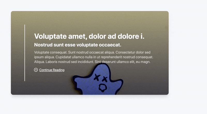
As you can see in the image above, a card starts with just a title and a background image. But as it grows, more information appears. It is quite satisfying to watch the way the card "filled up" vertically as its horizontal width grew. This gave me an idea.
Flexbox often looks awkward when sibling elements squish narrowly together to fill one row, and then expand suddenly when they are forced into the next row. This dramatic shift in dimension often looks very unnatural.
Filling cards vertically with content depending on their width could lead to much less sparse and awkward-looking layouts.
Resizable Flex Grid
At first, three Responsive Cards were added to a flex container. At wide-screen sizes, all three fit in a single row.

Now, since the cards are aware of their width, as the screen resizes, we no longer end up with two regular sized cards and one awkward stretched looking one. Instead, everything appears quite balanced. The two at the top have expanded to show a title and short description, the one at the bottom was large enough to show a subtitle too.

This was an unexpected side effect of the container query approach and it worked quite nicely. Could we make the layout more interesting?
To add a bit of variety, I thought about giving each card a sort of "priority" value. This was a numerical value that mapped directly to the elements flex-basis or its ideal width. What that means is if two cards are sharing a single row and one has priority 480 then it will render approximately double the size of the other that has a priority of 240.

Even with just a few cards, it's already way more visually appealing than seeing three identically sized cards in a row. Then I added some more.

Woah.. I was not expecting that! The varying widths were not only creating some nice patterns in the horizontal axis, but the varying amount of content appearing because of the container query approach was adding some real dynamism to vertical flow, too. Smaller cards were being stretched taller when placed next to wider cards that contained more content. Furthermore, when the browser got resized it would push some cards onto the next line which would result in new combinations of siblings and thus render totally different layouts. Pretty powerful stuff!
It was nice to be able to just throw items – seemingly randomly – into a grid and have everything "just work" at a variety of sizes without writing a single media query!
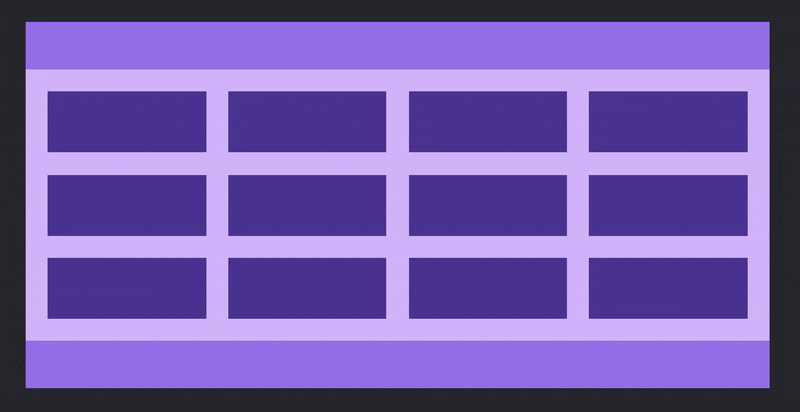
Working with a grid like this got me thinking about something that has annoyed me for ages — maintaining a sensible "gap" between items.
In the example above I'd been using the CSS property gap which has not landed in all browsers yet (currently just Chrome and Firefox) and given it a generous value of 3rem because I wanted the grid to feel nice and relaxed. The problem here becomes apparent when you resize the grid down to the size of a handheld device. Suddenly 3rem of gap looks ridiculous!
Let's try fix that with container queries:

In this is example I chose to use CSS grid instead of flexbox but the idea is the same for both. All that's happening here is an appropriate gap value is being chosen from a list of possible values every time the container element width changes:
const { ref, width, height } = useResizeObserver();
let gap;
switch (true) {
	case width > 720:
		gap = '3rem';
		break;
	case width > 540:
		gap = '2rem';
		break;
	case width > 360:
		gap = '1rem';
		break;
	default:
		gap = '0.5rem';
		break;
}
This isn't rocket science but it's not like anything we have ever been able to do efficiently before and felt like it could be quite a useful generic component. You can imagine components picking values for themselves like this from a theme with predefined breakpoints and spacing units.
The more adventurous folk might like to try using scalar values for gap, proportional to the elements width:
All together now
Remembering what Tommy Hodgin had said all that time ago when creating EQCSS, I decided it was time to put the responsive cards and the grid component to the test in more or a "real world" setting.
As soon as one of those responsive tables was displayed in a template that contained a sidebar, suddenly all of my responsive breakpoints turned into responsive brokepoints.
A typical "list and detail" layout, whereby a list of media cards are displayed with some filter options, and when a user clicks on a card, the detail view is rendered in an aside panel adjacent to the list.
Something like this:
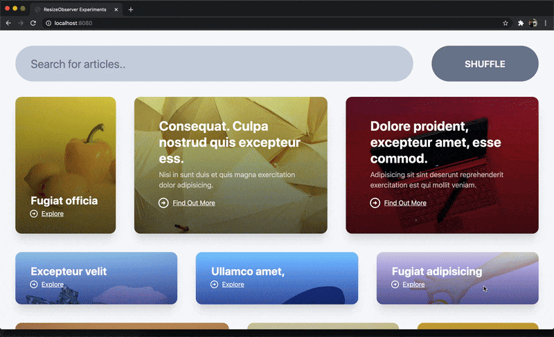
Now the effects are subtle, but everything seems to be working as it should. The cards lay themselves out and choose what content to show based on their widths. When the details pane is opened, it forces the grid itself to become smaller, which in turn reduces the gap between the cards. You might notice as well that the font size of the search input also reduces somewhat when the aside panel is open and that's because it has a ResizeObserver on it too!
Now, admittedly this isn't really groundbreaking, but hopefully it serves as an inspiration and as a glimpse at a possible future where components are more self aware. It's really interesting to see how these independently "responsive" components can be combined to create an interface that works as a whole.
In summary
I feel like we have only just scratched the surface when it comes to uncovering what's possible with container queries in JavaScript. The ability to modify markup and/or styles reactively at runtime, in an efficient manner like this, is certainly a powerful thing but it requires a lot of careful consideration to get right and it is certainly not universally applicable.
It would be fun to play around with some more elements like calendars, clocks, media players, modals, navs, tables, and icons as I think nearly all of them could be enriched in one way or another by employing techniques similar to those outlined in this article.
Unfortunately, that is all I have time for now. Sincere thanks for reading this far, I hope you learned something. If you would like to contact me please do so on twitter @lukejacksonn or on GitHub.