

Formidable exists to help clients solve incredibly complex software problems. We want to leave all things in a better place than we found them, whether it's a codebase, a client's team, or one of our own employees. We are here to create a longstanding, stable work environment for our employees to do their best work while also leveling up. Our purpose is to make a positive impact every day and we have only three core values: Autonomy, Inclusion, and Mastery.
We have experienced extraordinary growth in the past few years. Yet, our existing overall brand was difficult to explain and our logo mark could not be trademarked. Simply put, it did not scale. Our external visual brand was a mixture of space landscapes and geometric shapes supporting technical blog posts. Our internal reality is vastly different: warm, caring people, hilarious memes, office dogs, and insanely talented people. Our customers speak of us as trusted partners and part of their teams.
We came to the conclusion that our existing overall brand not only did not communicate what we wanted it to, but that it had some flaws that could be corrected. We'd long been known to be JavaScript experts, but as we expanded our portfolio to include a robust design department, back-end pros, and outstanding performance services, we needed to intentionally build a brand that was accurate to our offerings and people. We needed a cohesive playbook that we could hand off that clearly stated who we are, what we stand for, what we look like, how we talk about ourselves, and why.
What Do We Believe?
How could we create a brand system that encompassed our belief, our purpose, and our values? Here we offer our critique of our old brand artifacts and tone to show where we started, what we changed, and why.
Looking Back
Logo Issues
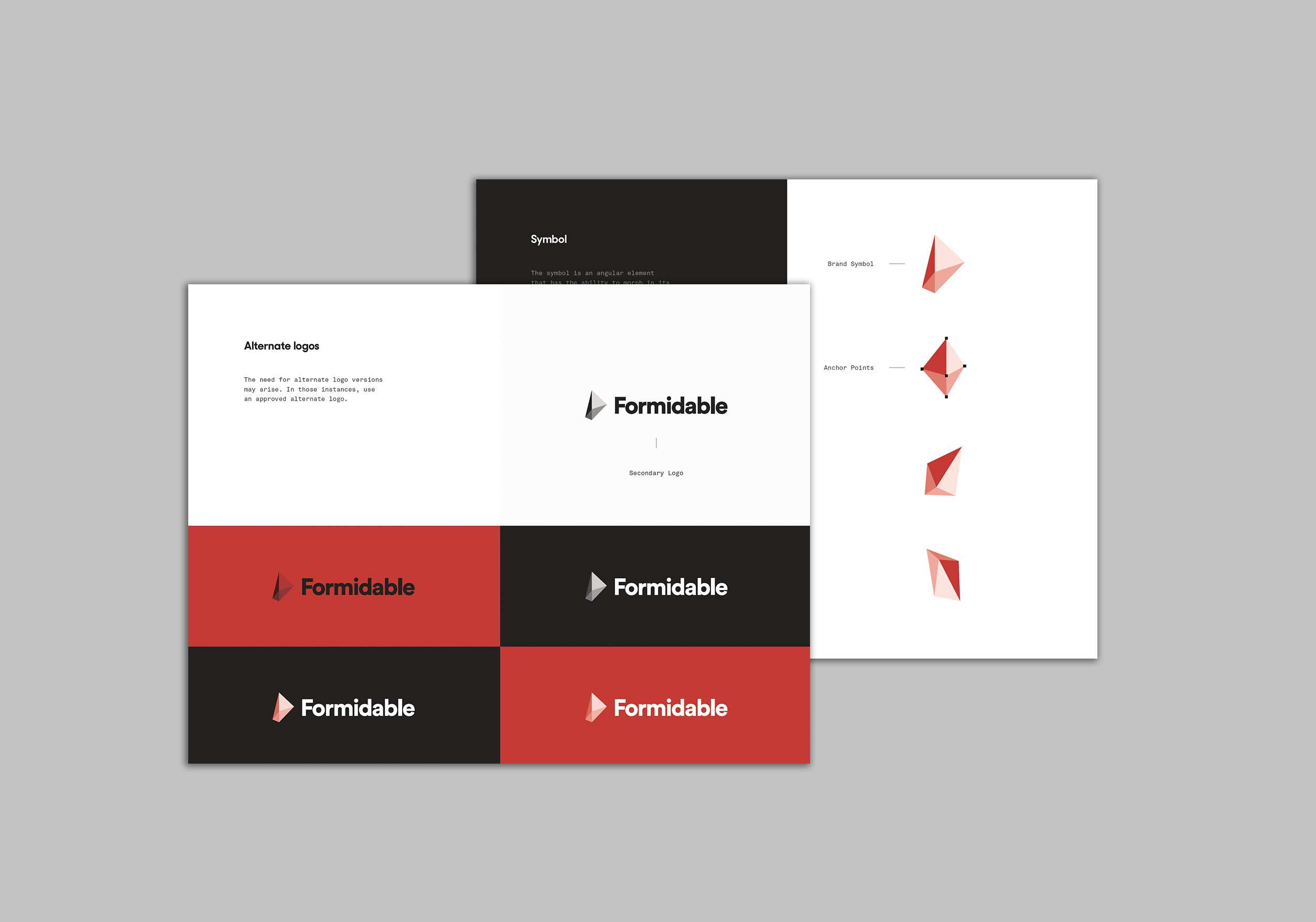
The previous logo (internally titled “The formidagon”) was an interesting idea with several execution flaws. The core idea — that it could appear in multiple variations of shape and size, reflecting our ability to scale up and down for a client — was brilliant on paper but difficult in practice. Designing a cohesive brand around a constantly shifting shape adds chaos to an already difficult task.
Additionally, two tactical decisions — that the ever-morphing shape had no right angles, and that it used alphas for shading, eschewing any true brand colors — made it very difficult to replicate successfully on printed products requiring monotones (teeshirts, sports bottles). Additionally, any letterheads or lock-ups using the mark looked off-putting and poorly aligned. This drove our design team crazy.
Typography Issues
Formidable’s previous brand used three typefaces: Sharp Sans No. 2, Akkurat, and Tiempos Text. While each typeface on its own is lovely, together they created a confusing brand position in which no typeface was the dominant voice. Because each was unique they would occasionally become disharmonious together. Additionally, as a shop that hangs its hat on a great deal of open source work, not having an open source typeface fallback caused problems.
Brand Tones In Space
Lastly, the company we know Formidable to be — inclusive, loving, friendly, helpful, and part of the community — was not represented by our website. Whether it was the brawny wordmark of Formidable in Sharp Sans, or the cold, black, space imagery of the site, the company was not being served by the brand artifacts and tone. Also, and this may be obvious, but we’re not a space company!
As a maturing company, we saw an opportunity to be intentional about what we wanted our overall brand to communicate.
Looking Forward
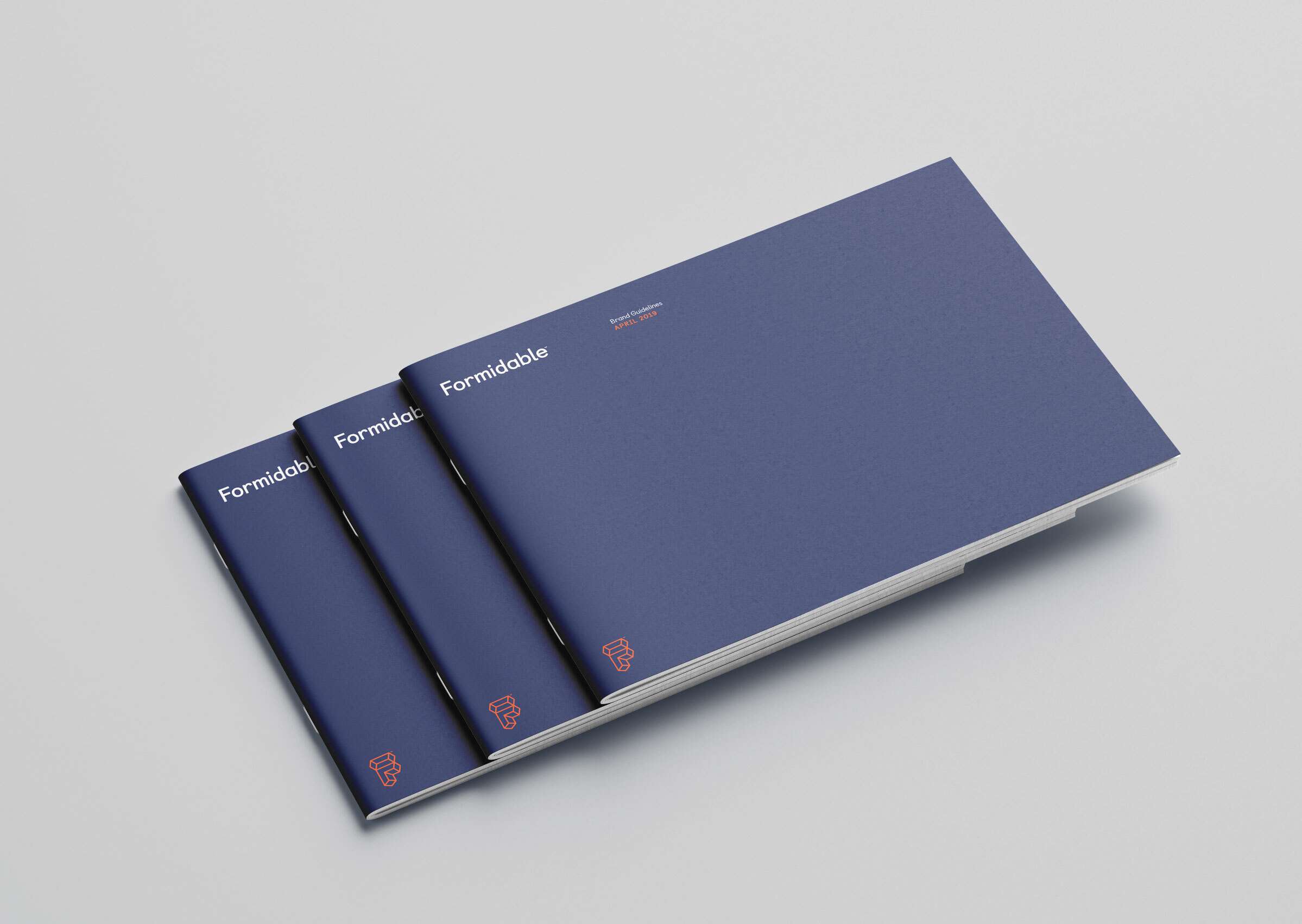
Meet The New Look: Our New Logo
Our design team is obsessed with the Bauhaus design movement of the early 20th century, and how, at a similar time of upheaval and technological change in the world, they stripped down their own aesthetics to focus on the simple truths of a mathematically inclined discipline. For them, it was architecture. For us, it’s digital product development. Though we are separated by one hundred years, we took many cues for our new brand from the school.
To start, the new Formidable brand is truly encapsulated by the new logo – our Formida-F – and our new color, which we are lovingly calling “Roarange”
Our new presence is warm, yet expert. Our new stance is friendly, but professional. Our new promise is one of intentional openness and technical rigor.
Our roarange F communicates many things: excitement, intersecting dialogue, self-confidence, and we even get to keep talking about mathematical rigor to boot (the F’s proportions are based on the Golden Ratio, naturally).
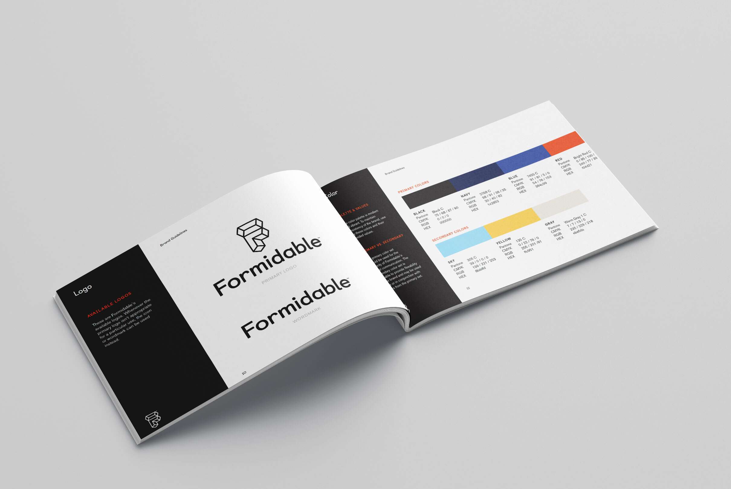
Meet The New Look: Our New Palette
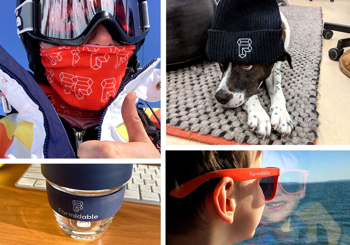
Our palette also leans heavily into primary colors that complement each other as well as our main roarange brand color. Anchored by the strong neutral of our navy and rich dark blue that communicate a base layer of professional expertise, the roarange, and the supporting bright, pop-y supporting colors are allowed to convey our internal culture of fun, openness, and inclusion. Plus, the orange looks excellent on dog bandanas.
Meet The New Look: Our New Typography
Our new logo is set in Castledown, a typeface originally designed to help children with dyslexia learn to read handwriting. It’s a stark departure from the strictness of Sharp Sans No2, and that's intentional. Our fear, when adopting the Formidable F, was that we were straying too far into a mathematically cold universe we tried to leave behind. By adopting the friendly, humanistic Castledown, and relatively unusually, using it for our H1s, we’re making sure our humanness shines through.
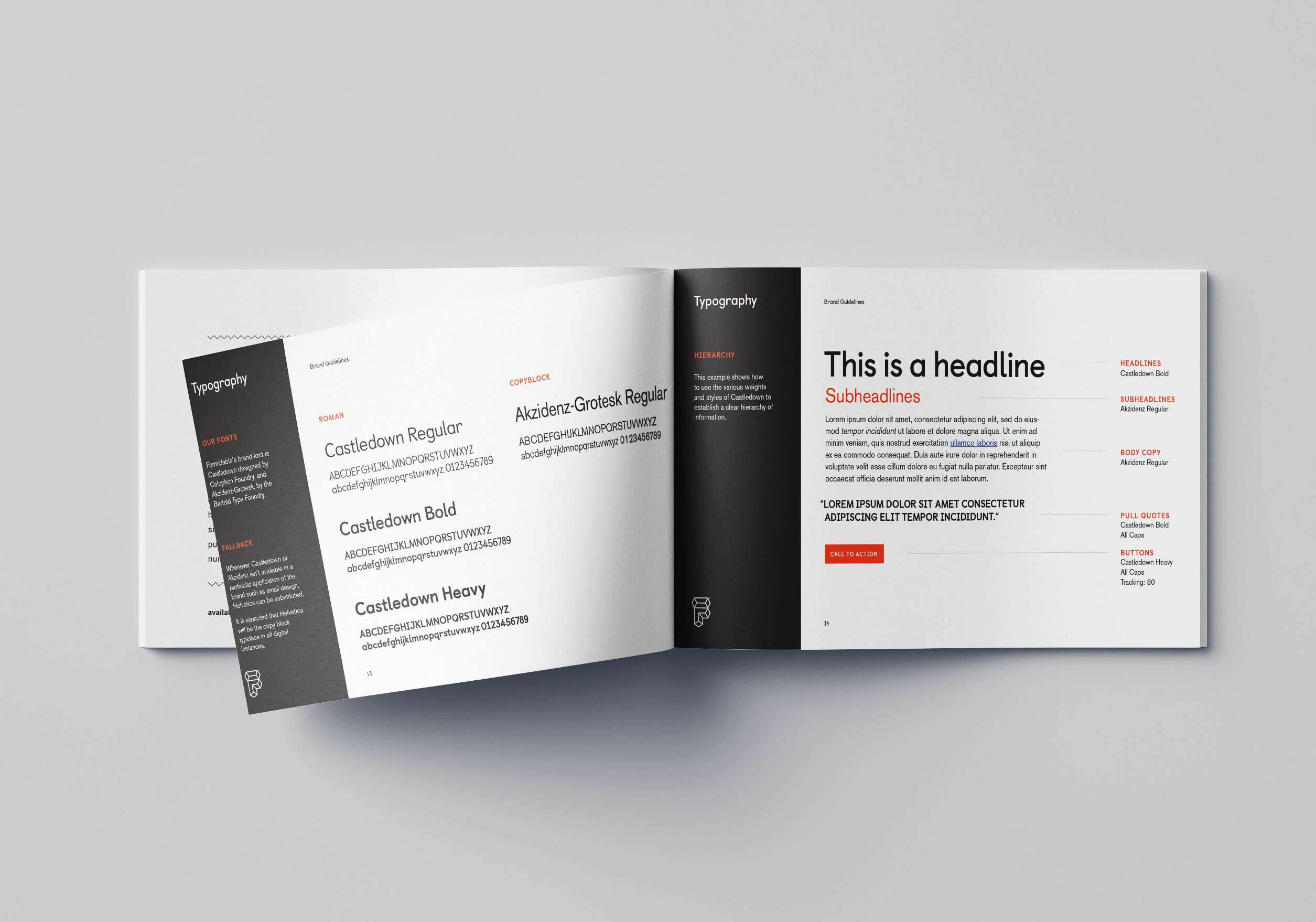
In order to offset the Castledown, we adopted a grandfather of the san serif gothic set, the august Akzidenz-Grotesk as our copy font. With its relationship to both Helvetica and the Swiss Style, Akzidez harkens back to those central European design instincts so beloved by the Bauhaus movement. An additional benefit of having a copy typeface so closely related to the simple Helvetica is that our open source offerings can use
Meet The New Look: Our New Brand Vibe
Moving away from the flat, yet factual tone, we've shifted to embrace the collective voices of our team. Our new brand tone conveys accuracy, mastery, but always and without fail, with an eye on being helpful — always striving to find the thing people need so they can be their best. Our language is clear and always easy to understand. Leaning in instead of out, and always making room for everyone, our vibe is real and our tone is true.
In Conclusion
Great thought and care was put into creating a scalable, relatable brand system. In close collaboration with our agency partners, Formidable has evolved an identity that will grow with the company and mature as we age. We're the same kind, quirky, helpful experts we've always been and we look forward to speaking with you about your digital product needs. How can we help?