
Formidable design team has developed a card-based user testing model to meet the needs of client projects that require early-stage research and concept validation. As part of our commitment to open source, we are sharing our learnings and best practices related to this methodology.
We welcome your feedback and questions as we continue to develop the UX Deck testing model.
Design is Listening
The purpose of design is to solve product users’ problems. This requires listening to the users’ needs and designing a solution for those problems. In an ideal world, this is the order in which the design process works, but in practice, it can be frustrating, repetitive, and prone to assumptions. Despite our best guesses, designers aren’t mind readers. Communicating design ideas in the early stages — which is necessary to iterate and get feedback before shipping a high-fidelity design — is prone to gaps in understanding. The traditional models of UX model verification include sketches and paper prototypes, which are very helpful for communicating within the design team which shares an established visual language but are often confusing and uncompelling to users.
An additional drawback in the current state of user testing is that the modeling order is backwards: the designer makes assumptions, then asks the user to react. This method is telling, rather than listening. Sketches solidify, too early, the visual format of an idea in order to present the idea itself. Designing screens or other visual interfaces (UI) in order to get feedback on the proposed product process (UX) is indirect and frequently leads the discussion in unproductive directions. Open discussion is cognitively unmanageable at a high level of detail, and prototyping takes time, isn’t universally understood, and solicits feedback on the design rather than the idea.
How, then, can a design team solicit feedback on a product that doesn’t exist?
First Model, Then Design
Formidable was hired by a client developing a new user experience for their brand. One of our core requirements was the ability to investigate how users might interact with an experience that we didn't know much about yet. We needed to create a methodology to explore general questions like “is this valuable to customers at all?” while also validating early specific details about how the experience might work step by step. We generated a lot of different ideas about possible experiences, and we didn't want to narrow the possibilities too early and close off a potentially fruitful avenue of exploration. At the same time, it is impractical to explore more than a few of even the lowest-fidelity prototypes with individual user sessions, and the experience would have too much complexity to handle in a straightforward "how do you think this might work?" discussion.
We needed to evolve our testing process to better fit the problem. In the classic “double diamond,” designers “prototype, test, and refine.” This means a cycle of designing to get feedback (idea to lo-fi design to feedback), which is a time-consuming process of guess and check. How could we instead get feedback on our ideas and then design, so that every part of the design process is informed by user needs and values?
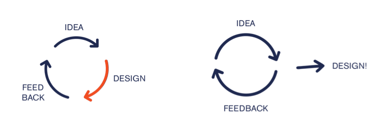
We decided to model the process to solicit user feedback, then design based on that feedback. This is common wisdom in UX design practice, in which journey mapping and user flows typically precede sketching and UI design; ideally, user testing could follow suit. To do this, we needed to develop a testing methodology that was
 Targeted:
 Reliable:
 Open:
Open:
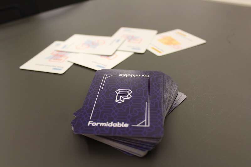
Introducing the User Testing Deck
In exploring options for allowing users to play in a space and come up with their own solutions, we quite naturally gravitated to the game space, specifically, board and card games. Games promote exploring different paths to the same solution, and engage the tester in a tactile way to promote creative thinking and make a complex problem compelling. (Without the cards, Magic: The Gathering is just a very long math problem.)
We decided to try to generate a few possible journey maps for the product based on competitor research and brainstorming, then break down these user journeys into discrete steps to then model with a card deck. It worked like a charm.
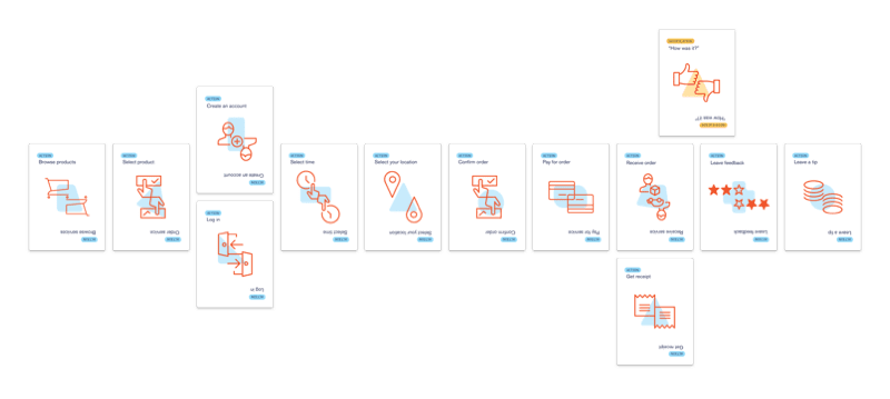
The deck allowed us to build a visual model for users’ ideas about how the product might work (without committing too early to UI concepts), to “set the scene” for users so that testers could imagine how it would feel to interact with the product, and to rapidly and easily experiment with a variety of solutions. We created a card deck that included three card types:
- Actions (steps taken by the user to interact with the product)
- Notifications (communications or other information from product to user)
- Events (outside factors or situations which affect the user’s interaction with the product)
This allowed us to build each tester’s ideal product side by side with them, discuss each specific Action and Notification, and “challenge” their ideal paths with Events.
How to Win Friends and Influence Pizza
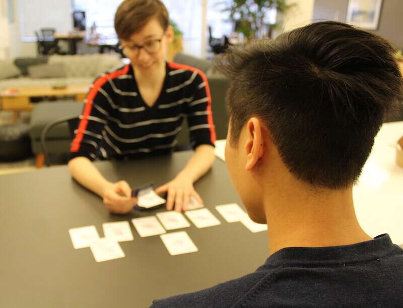
To demonstrate how to develop a user testing script using the cards, let’s walk through creating an online-ordering pizza delivery experience with designer Ada and tester Fry.
A pizza delivery experience, by definition, must include selecting, paying for, and receiving a pizza; we start with these step cards laid out to provide a basic product framework:
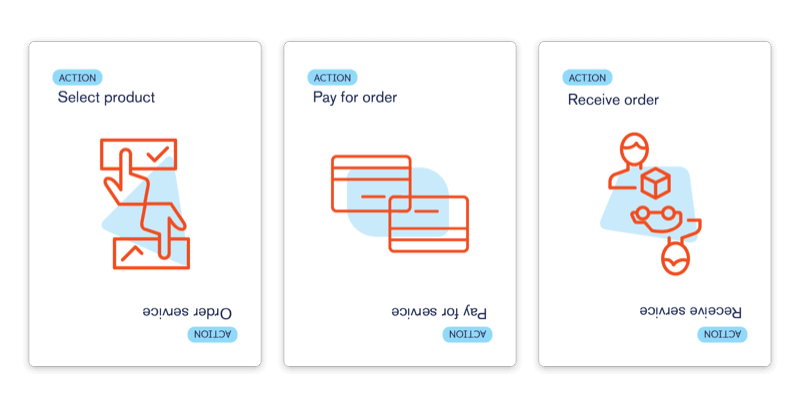
Using the cards makes it easy to dig into details about each step while keeping the full experience in mind. You can use the above cards to spark discussion about how the user would like to browse and order, what payment methods they would like to have available, and about their timing expectations with regard to receiving the pizza. For projects with the possibility for mixed interaction methods, we have added Method tokens to discuss and explicitly represent how customers would like to interact with each step: app, voice, text, etc.
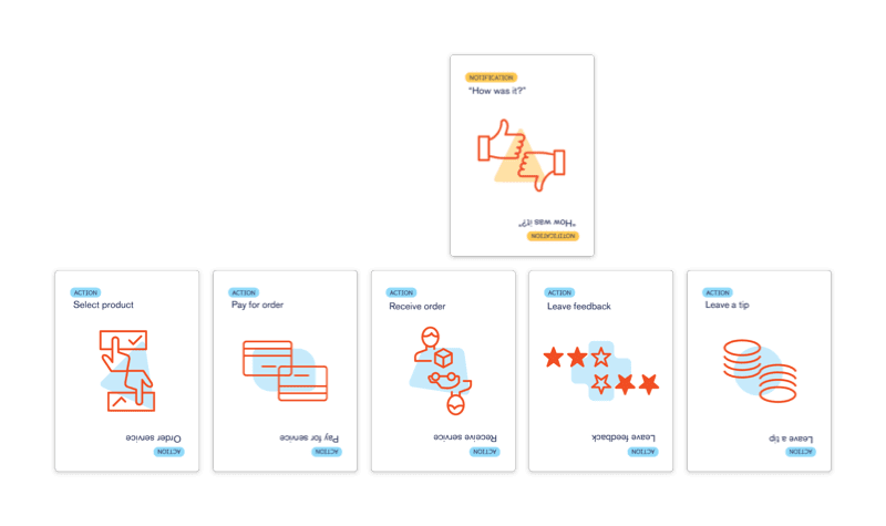
Our pizza tester Fry decides to select pizza, prepay with checkout, and receive the pizza. Designer Ada asks about whether Fry would like to leave a tip, and if so, how and where. Fry tells Ada that he’d like to be able to add a tip after he has a chance to evaluate the speed and courtesy of service provided at delivery, so they add a “Leave feedback” step as well as “Leave a tip.” Fry notes that he sometimes forgets to review or tip for services unless prompted, so he and Ada add a “How was it?” notification step and they discuss what communication methods are most convenient (in this case, push notification).
We have found that card-based discussion leads to unusually frank discussion about topics, like tipping, that are often prone to social desirability bias. Testers focus on the process they are building instead of considering the topic generally, more like an observational test than a discussion. Rather than asking about general behaviors or values (“do you usually tip?”), building out the user experience allows the user to “set the scene” and discuss what they would do in that situation, which prompts a greater level of detail and openness about these behaviors (“since I paid a service fee at this step, I wouldn’t want to tip at this step” or “I would tip, but only if I could evaluate service first”).
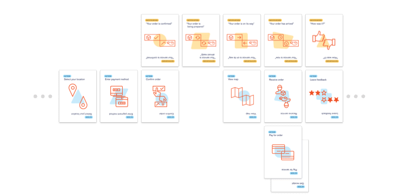
Ada asks Fry about other user actions to complete or automate during the ordering process, such as how and when to browse and select pizza order options, enter an address for delivery, choose what time he’d like to receive his order, create an account to save orders/preferences, and receive a receipt. They discuss order tracking functions and notifications, including what communication methods Fry prefers and how much or little information he feels most comfortable receiving about his order in progress. He notes that he would like some key updates pushed to his phone, but feels like he gets too many notifications, and prefers the idea of a map tracker he can check manually to get more in-depth updates.
Ada and Fry review the process together and Ada follows up with any remaining questions about Fry’s preferences when using the product. They then challenge Fry’s ideal process with an Event: How should this product respond to an order delay of 30 minutes, after the order was submitted and confirmed? Fry would want a notification, with an opportunity to contact customer service to cancel his order in case he would no longer be able to receive his order at all. He also expresses concern about prepayment in case the order delay is long enough to prompt him to cancel, and he decides to enter payment when ordering but have the payment processed upon receipt, which he notes improves his confidence in the process even in the ideal scenario:
Testing with cards makes hypotheticals like this order delay simple and concrete. Using the Event cards allows the design team to “stress test” a product idea before producing or even designing it. User testers are able to gain a very clear idea of the trade offs they are making when building a product. With the steps laid out in front of them, users can easily track fairly complex cause and effect with minimum cognitive load, and make changes to develop a more resilient process.
Uncovering Desire Paths
How do we turn individual gameplay sessions into the data we need to design a product? We used a four-step process to complete our testing:
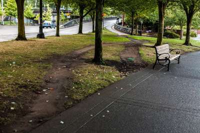
- Define play space: Gather requirements and limitations, and define basic goals and conditions for success, leaving room for user input to shape the project. We developed this style of testing as a method to uncover desire paths, a landscape design term for user-preferred ways to navigate a space.
We define our problem space by determining the steps required to create a functional product (returning to the example above, selecting, paying for, and receiving a pizza), giving testers a few “checkpoints” to include in their path through the game, and allowing testers to “choose their own adventure” for the rest.
- Develop a user-driven activity: Develop the deck and a testing script based on the essential process steps and learning goals for the sessions. After surveying competitor products and brainstorming a variety of journey maps for a product, we break the steps into a custom card deck to account for the likely interaction steps (and include blank cards to allow users to come up with something we hadn’t considered).
- Observe responses: Look for desire paths, points of consensus, within the aggregate of individual testers’ ideal products. We observe users’ reactions to “using” the product they built as they built it, since testers are able to set the scene and share detailed situational feedback about the prospective user journeys.
- Synthesize emotional response data with other metrics: Outline testers’ desire path and review our observational findings for information about user goals, values, and preferences, which inform the product throughout the design cycle.
The Case for Card-Based Testing
Why use the UX Deck methodology?
Get feedback on the idea, not the design
The current state of user testing is often about getting reactions, not about listening. Assumptions can be challenged by users at this stage, but there is also a risk of baking them in, and of miscommunicating the idea behind the (often obscure) visual language of lo-fi design. Testing with cards ensures that you’re communicating the model, not the design, and keeps feedback focused on the idea as opposed to the visual.
Get unique feedback
UX Deck testing elicits unique data that we don't believe would surface during guided discussion or by asking users to react to prototypes.
Ask very specific questions
Having the cards laid out means that we can get into a high level of detail without relying on recall.
Weigh tradeoffs
The cards allow us to talk through what the user would do in the real world; since we are going step by step and building a scenario together, we are asking about situational rather than general behavior, which testers are more comfortable and open about sharing. This is especially helpful to keep discussion neutral and realistic regarding high social-desirability-bias topics, where there is more often a gap between what users say and do.
Explore more solutions, faster
Testers can rearrange, add, and remove steps to test new ideas throughout the discussion at nearly zero time/effort cost. The design team can easily build a deck to facilitate basically unlimited blue-sky brainstorming, or constrain the options by using the game script to keep users within known design or technology requirements.
Reduce the power of dark patterns
Helping make a product together is more accessible and human-centered rather than asking people to react to an established product. No one designs a dark pattern for themselves; each tester will use their own goals and values to inform the solution they build along with the designer, and the co-creation process facilitates open discussion about how testers want to use a product and how it fits into their lives more broadly.
User emotions are important to the usefulness of a product, and not necessarily implied by their behaviors or their reactions to a prototype. We have been able to use the cards to unpack topics like data privacy, where users may act one way based on a direct prompt (e.g. “I would turn on location services” when shown the option in a prototype) despite having discomfort about it. When testers are instead given the opportunity to shape the product themselves, they open up about why they might make a certain choice, how they feel affected by the product’s influence over them, and are more able to articulate their emotions and value considerations related to their ideal product (e.g. “I really like the convenience offered by this product ‘knowing’ my location, but I would really like to be able to set time parameters so that I am in control of when my location is being tracked.”).
Have more fun!
User testers enjoy the sessions, and frequently comment on how much fun they had “playing the game.” This makes the user interview itself a positive brand experience, which is a great benefit to our clients.
It is also more fun for the design team; outlining the problem, creating a framework for the product to represent via the cards, and working side by side with the user to gain insight into their goals and preferences is deep, interesting, rewarding work, and it makes rapid paper-prototyping at this stage of the design process feel like tedious guess and check by comparison.
Download the deck!
Bring the UX Deck into your own design practice by downloading printable cards here. Let us know what you think!
Interested in learning more, or developing a product with us? Contact the Formidable Design team!